Redesign the website to improve the learning efficiency
Dec, 2023 -
Apr, 2024
Ready to be launched
Shuddhi Vidhya
Project Manager | Eki Ero
Visual Designer | Diogo Malheiro
Visual Designer | Suri Wang
Ux Designer | John Koffi
Ux Designer | Eric Khuu
Ux Designer | Angela Yang
Founder X 1
Developers X 3
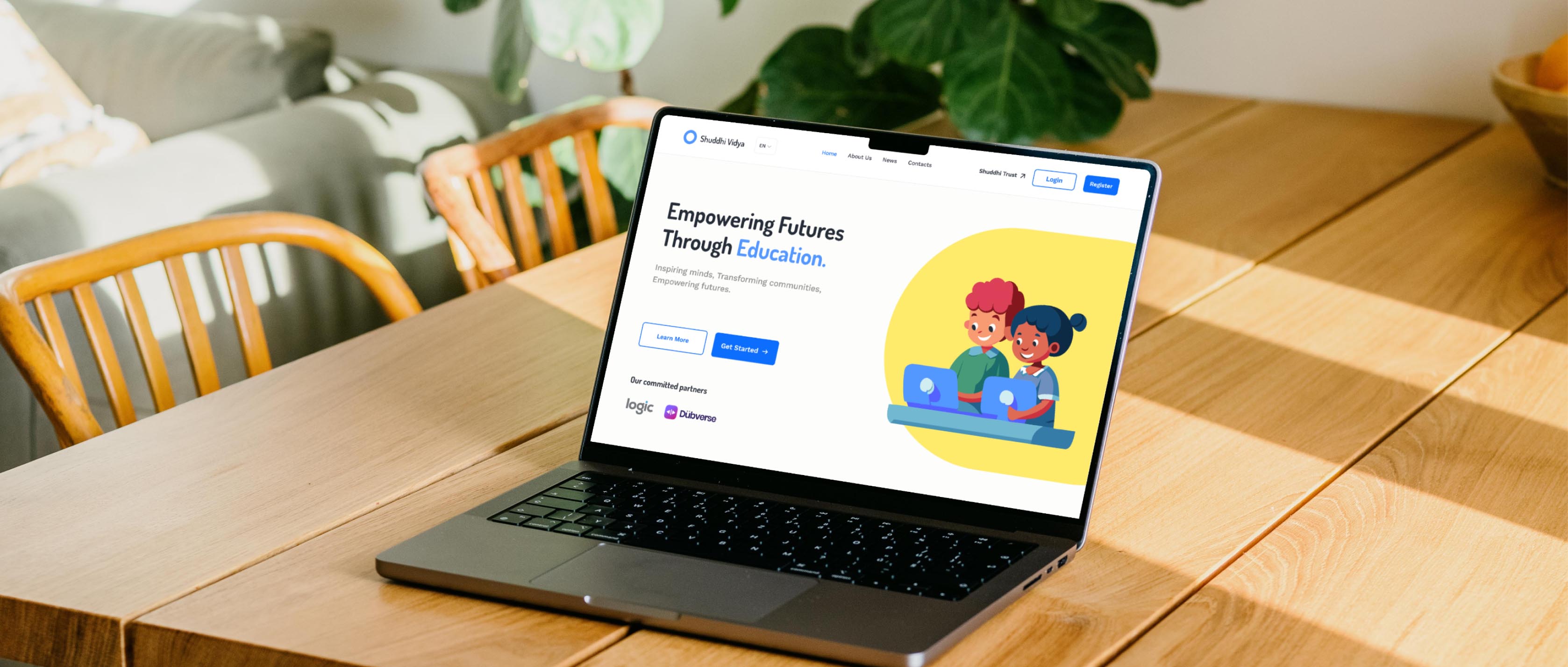
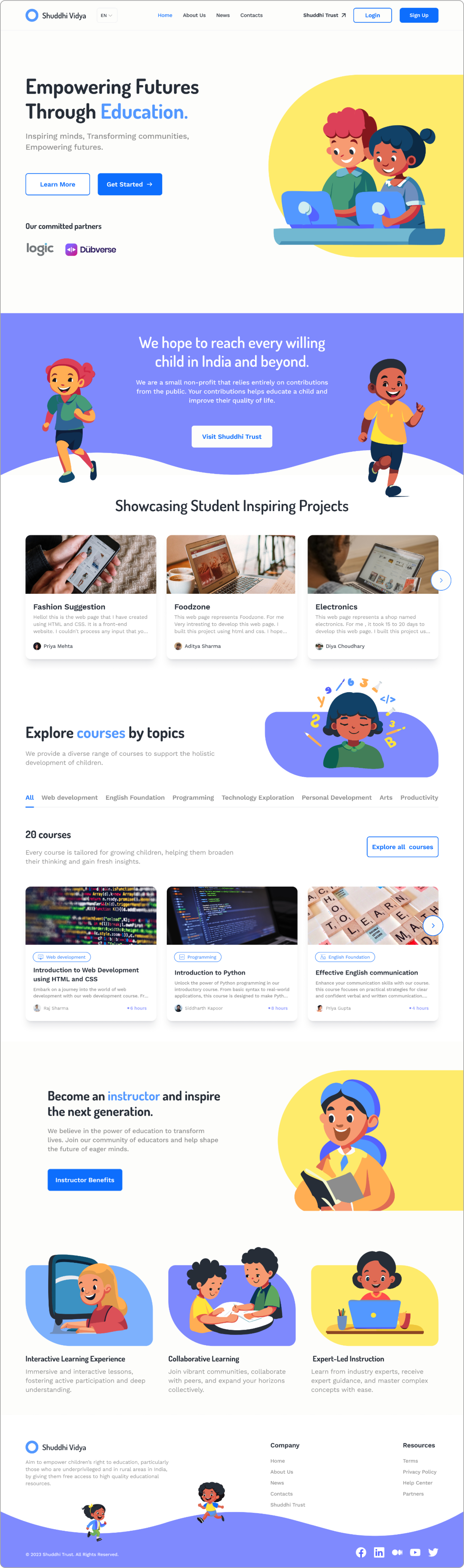
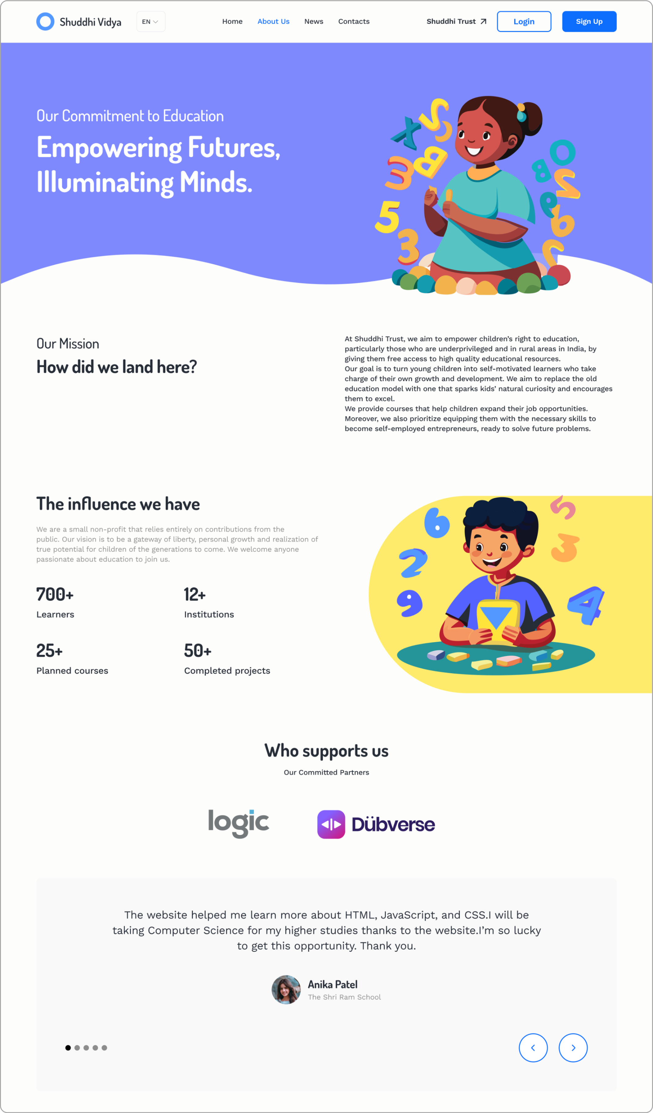
Shuddhi Vidhya is a non-profit organization based in India, dedicated to championing children's right to education, particularly those in underprivileged and rural communities. With a mission to enrich the learning journey, the founder of the organization has decided to redesign their learning platform to ensure greater accessibility, interactivity, and effectiveness in delivering educational content to marginalized communities.
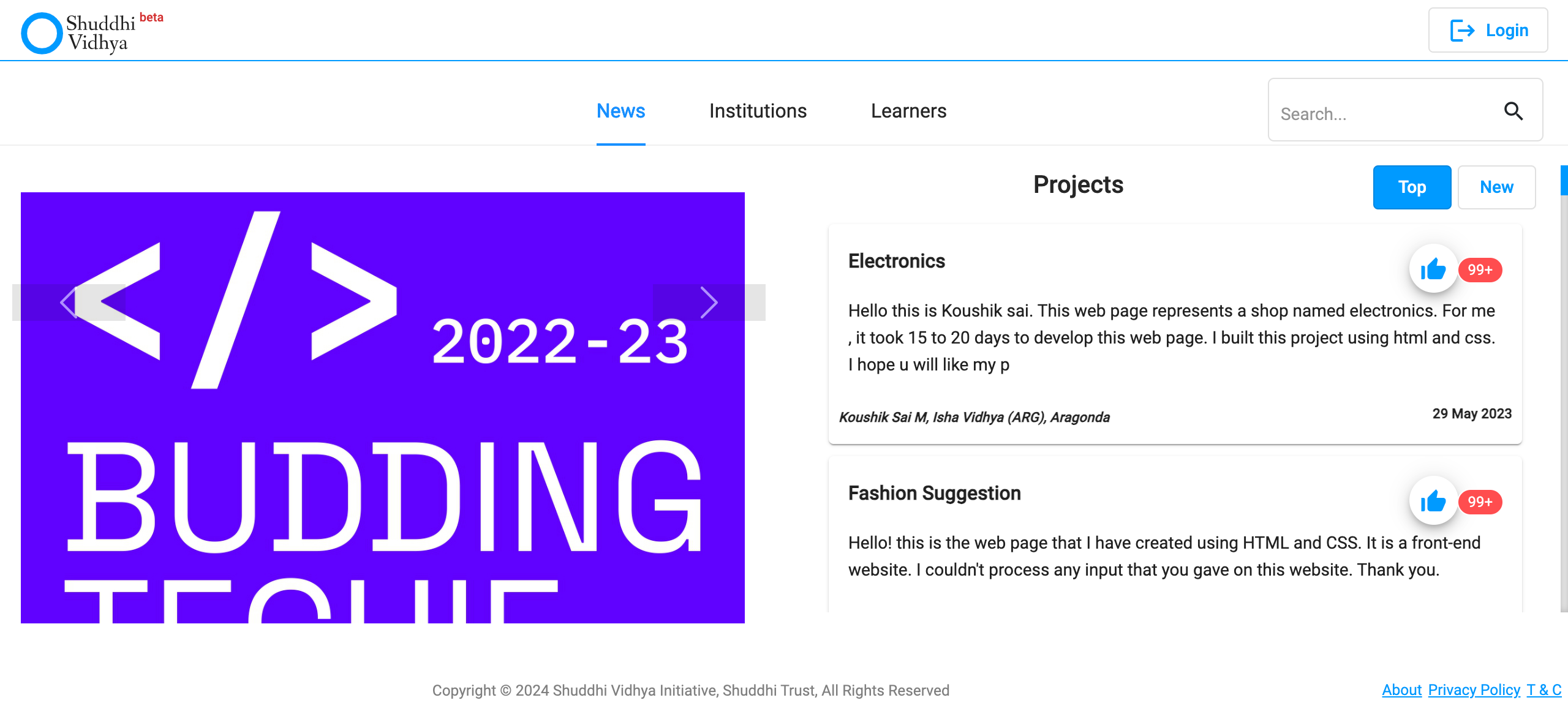
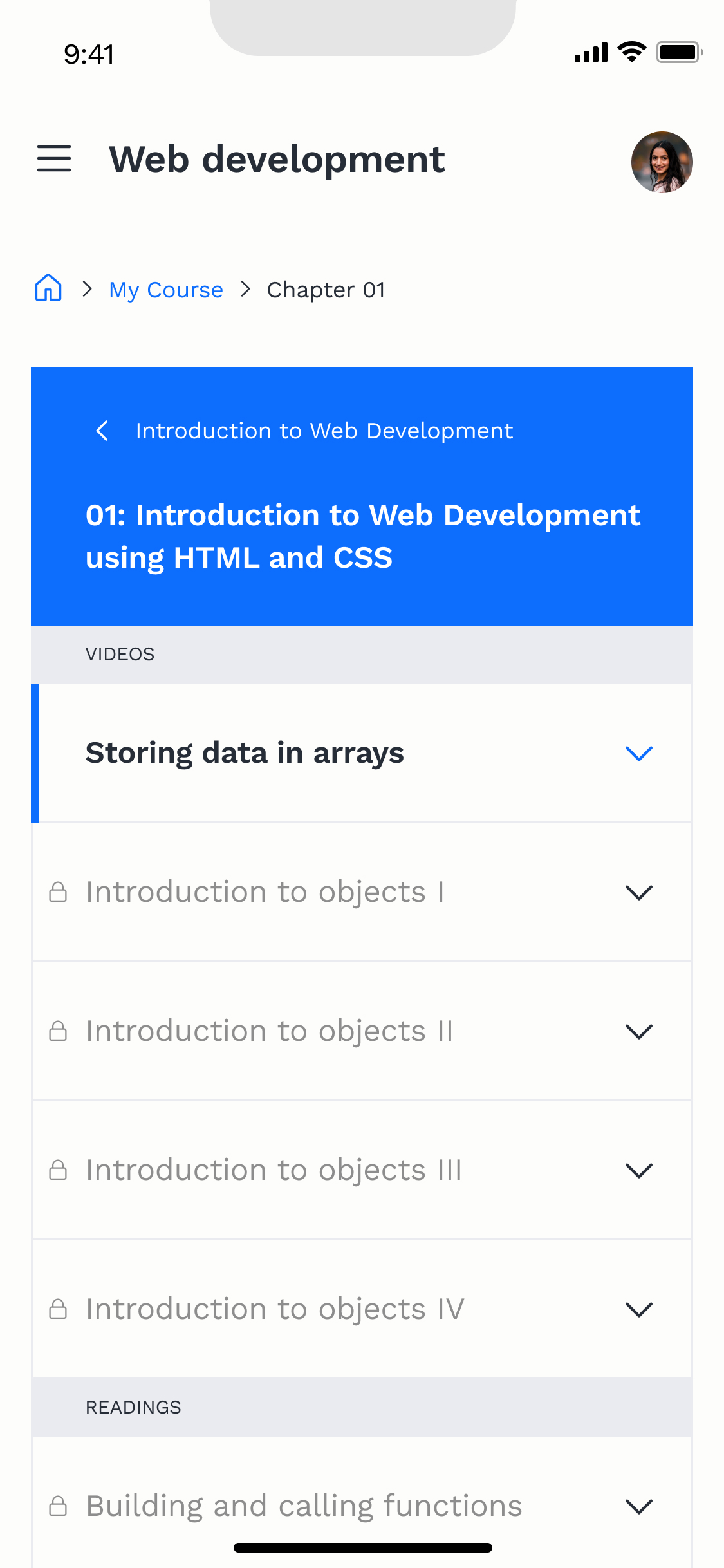
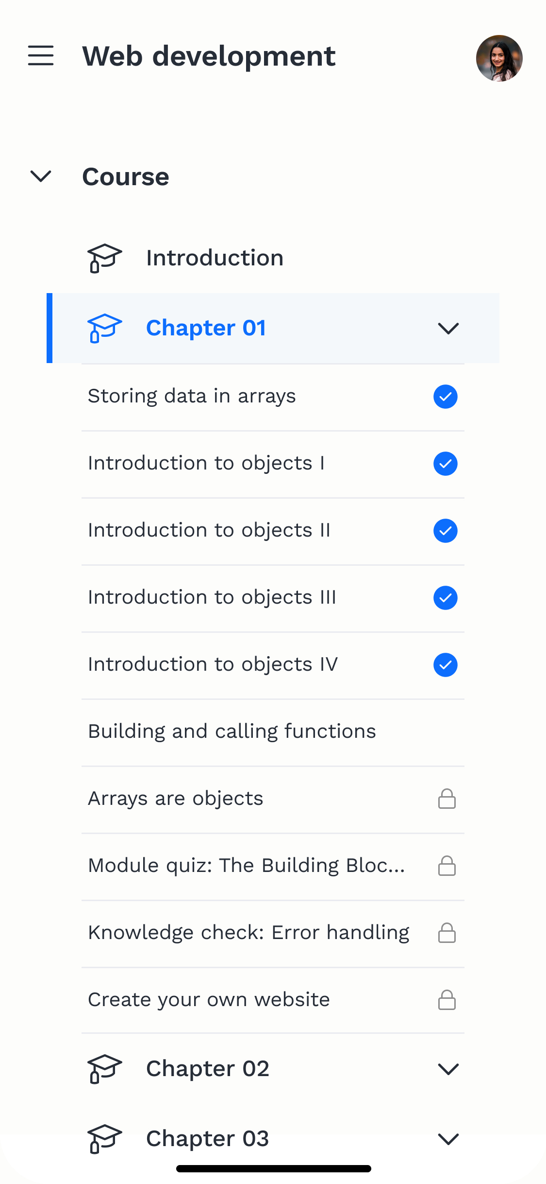
The beta version of the Shuddhi Vidhya learning platform currently enables student registration and project submissions. Once students register and log in through the official version, they will be directed to the organization's YouTube channel to start their learning. Both students and instructors are eager for an integrated platform that facilitates learning and teaching.
The wireframes were distributed among three UX designers, each with varying levels of experience. This resulted in some wireframes lacking continuity, necessitating additional time to reorganize and refine them. Continuous communication was essential to grasp the underlying rationale and logic behind their respective designs. Additionally, my role entails active participation in meetings with web developers, where I integrate feedback and refine designs based on their valuable suggestions.
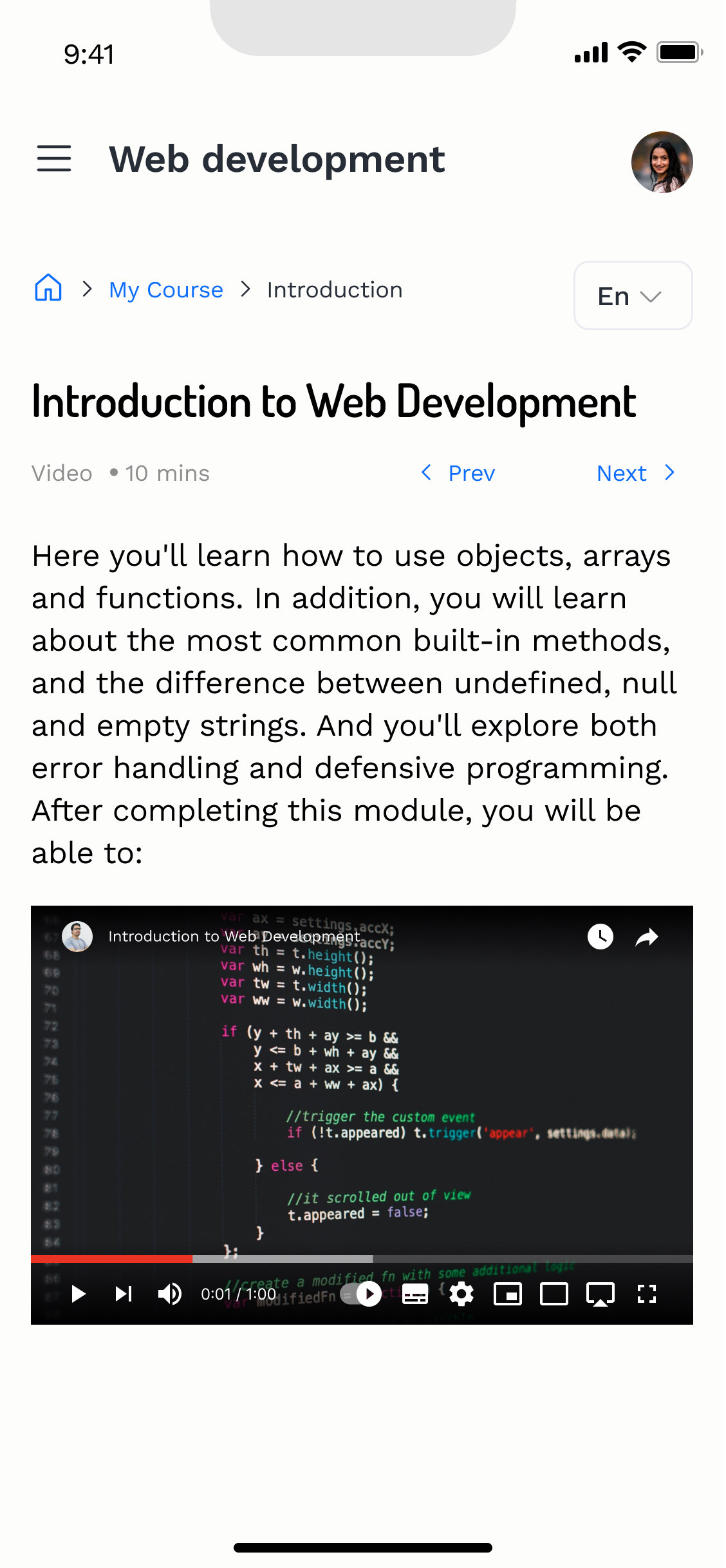
Developing an all-in-one learning platform for students and instructors ensures that students can easily and effortlessly complete their courses, while enabling instructors to maintain teaching quality by addressing any questions and monitoring student progress
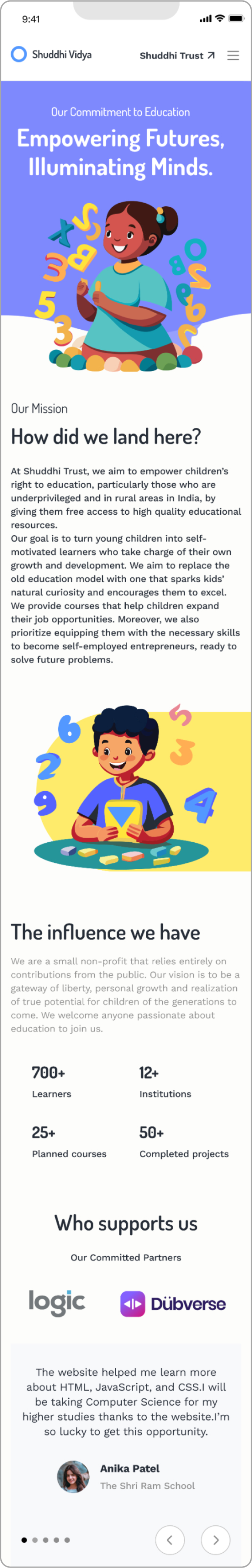
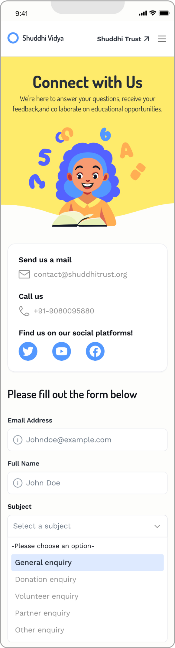
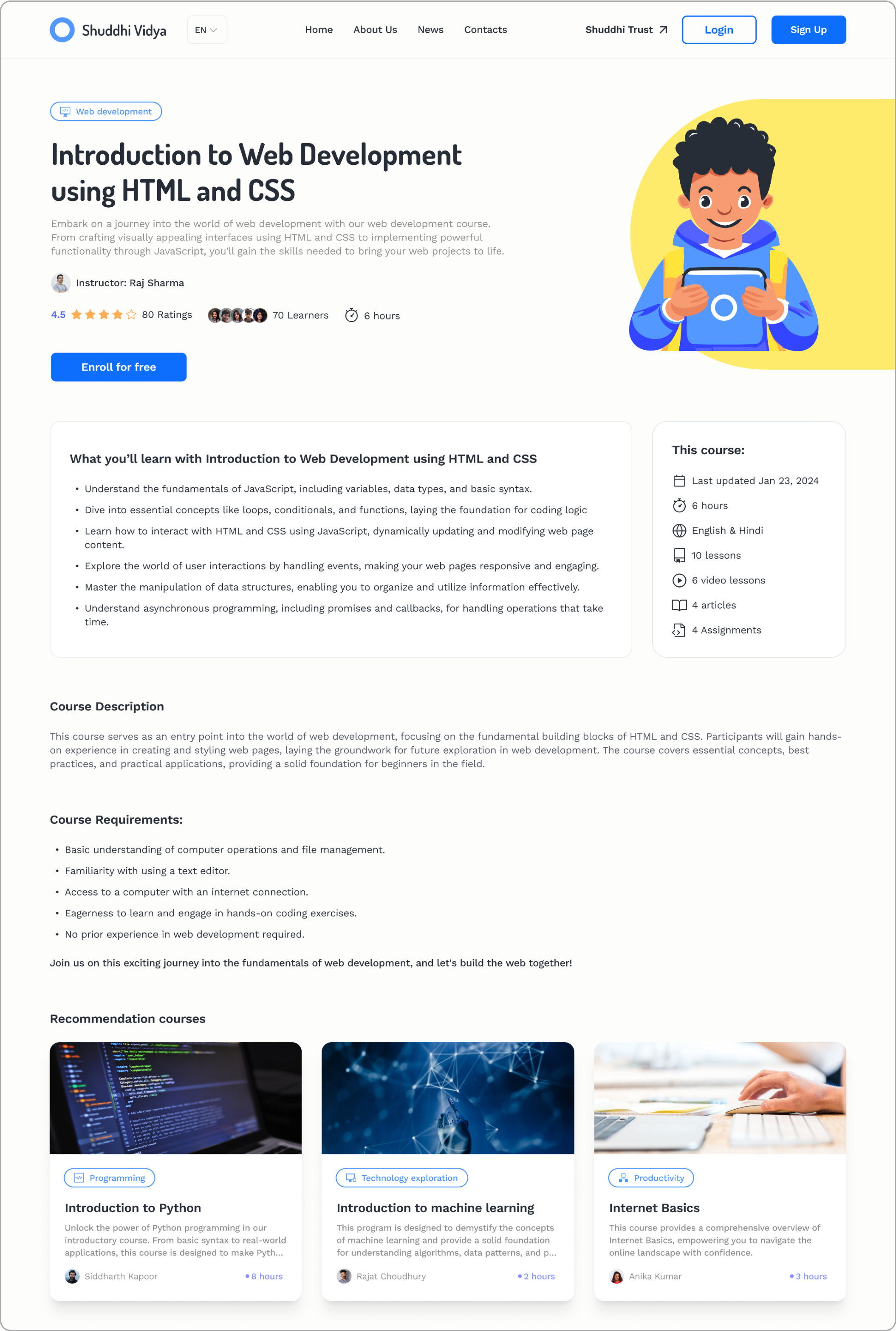
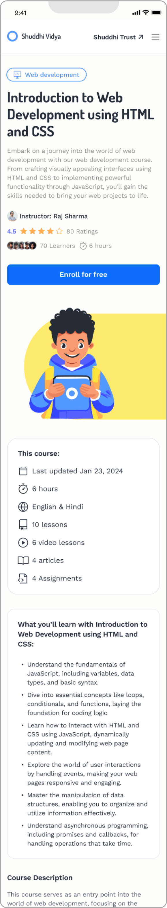
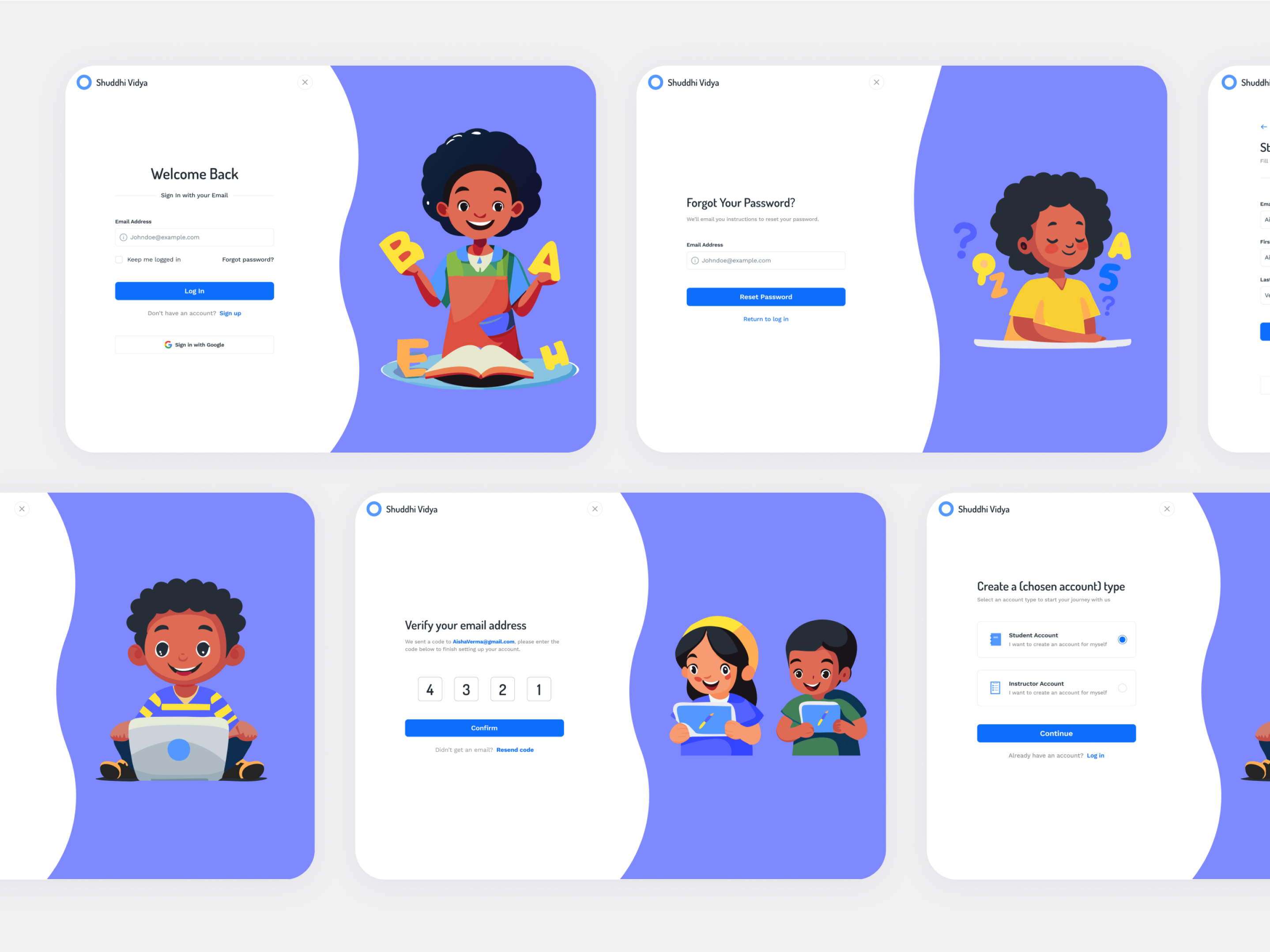
As a visual designer, I've taken on the responsibility of UX design for the mobile version, as well as visual design for both desktop and mobile platforms.
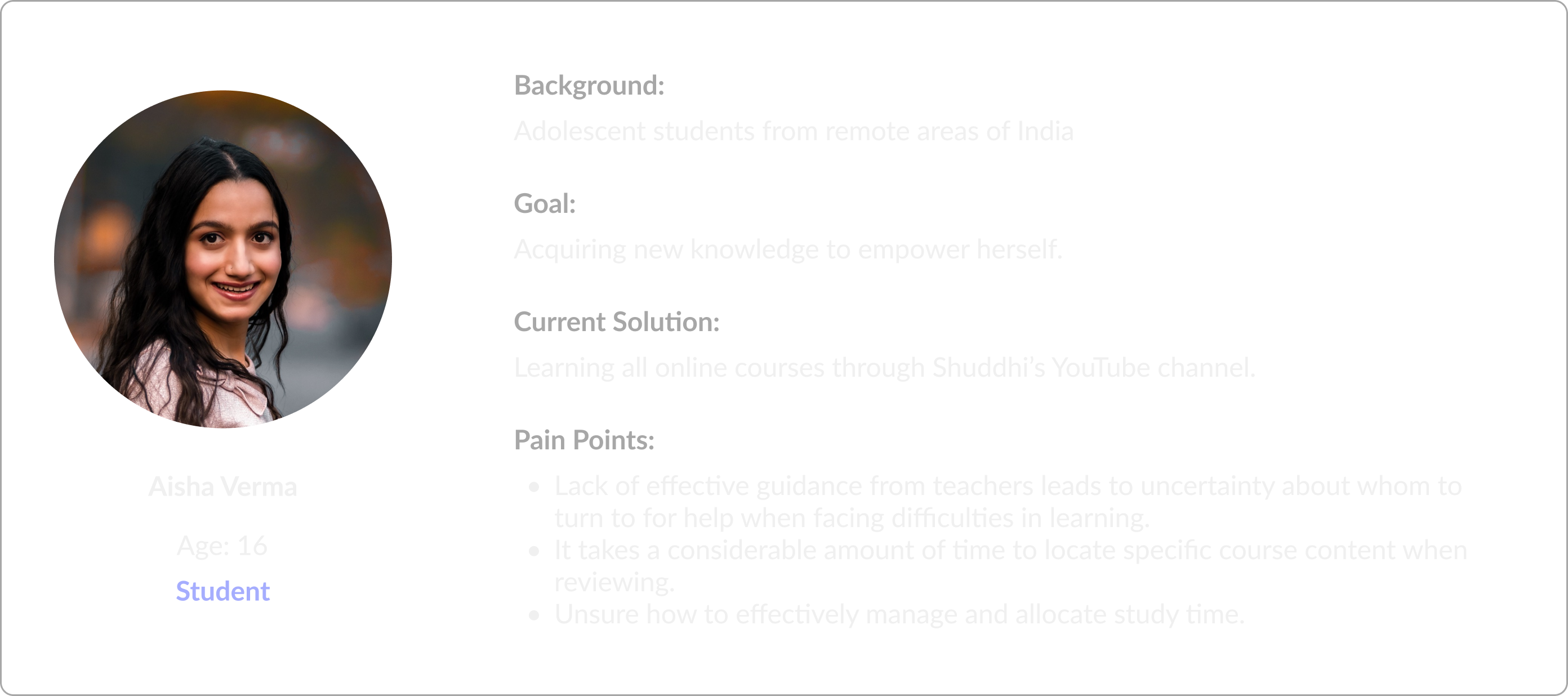
Indian teenager students
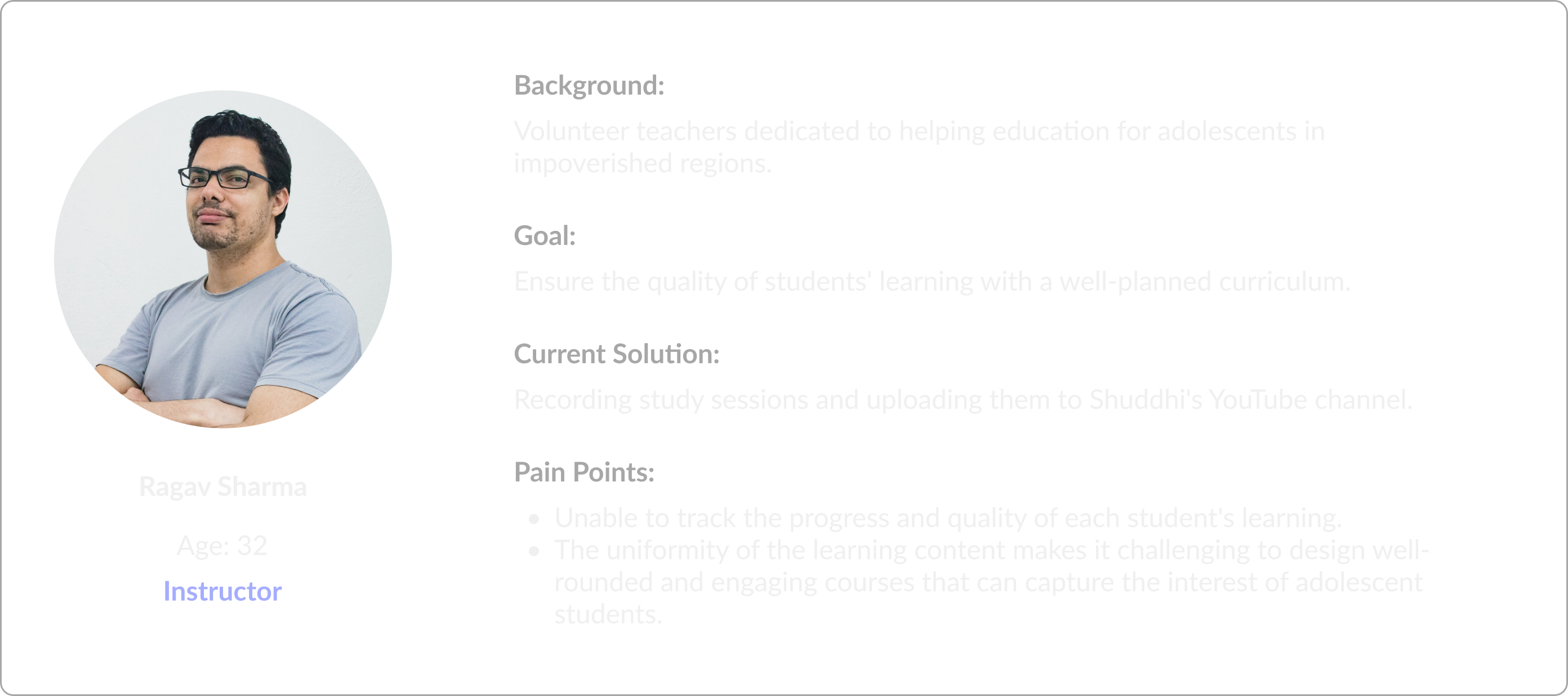
Instructors
Lacks clear hierarchy and focus.
Content is monotonous and lacks substantial information.
Not adequately tailored for a user-friendly experience for teenagers.
Unable to track students' learning progress.
Lack of effective after-class tutoring and Q&A
Insufficient communication among students and insturctors.
Embark on a journey into the vibrant world of youthful imagination with our thoughtfully crafted color palette. Tailored for teenagers, our palette features a dynamic array of five lively shades, transforming the learning process into an engaging and delightful adventure.
Color of the background
#FDFDFB
Brand color
#5398FF
Main color for text
#272D37
216, 38, 59
#D6F8FBF
235, 100, 66
#5463FF
216, 98, 52
#0D6DFD
32, 100, 66
#FFAE54
52, 100, 62
#FFE53B
Infusing our website with vitality, we employ a dual-font approach to achieve a dynamic design. The bold and expressive 'Dosis' font commands attention, making it ideal for impactful headlines, while the timeless elegance of 'Work Sans' ensures readability across descriptions, buttons, and other text blocks. This strategic blend of fonts imbues our site with personality, highlighting the significance of various text elements.
Accent font for large headlines
Semibold
Bold
The main font for descriptions, large texts, buttons and additional elements
Regular
Medium
Semibold
Bold


By focusing on the students' & instructor’s perspective in the sitemap, it helps us identify potential pain points or areas for improvement in the user experience, leading to a more user-friendly and intuitive website design.
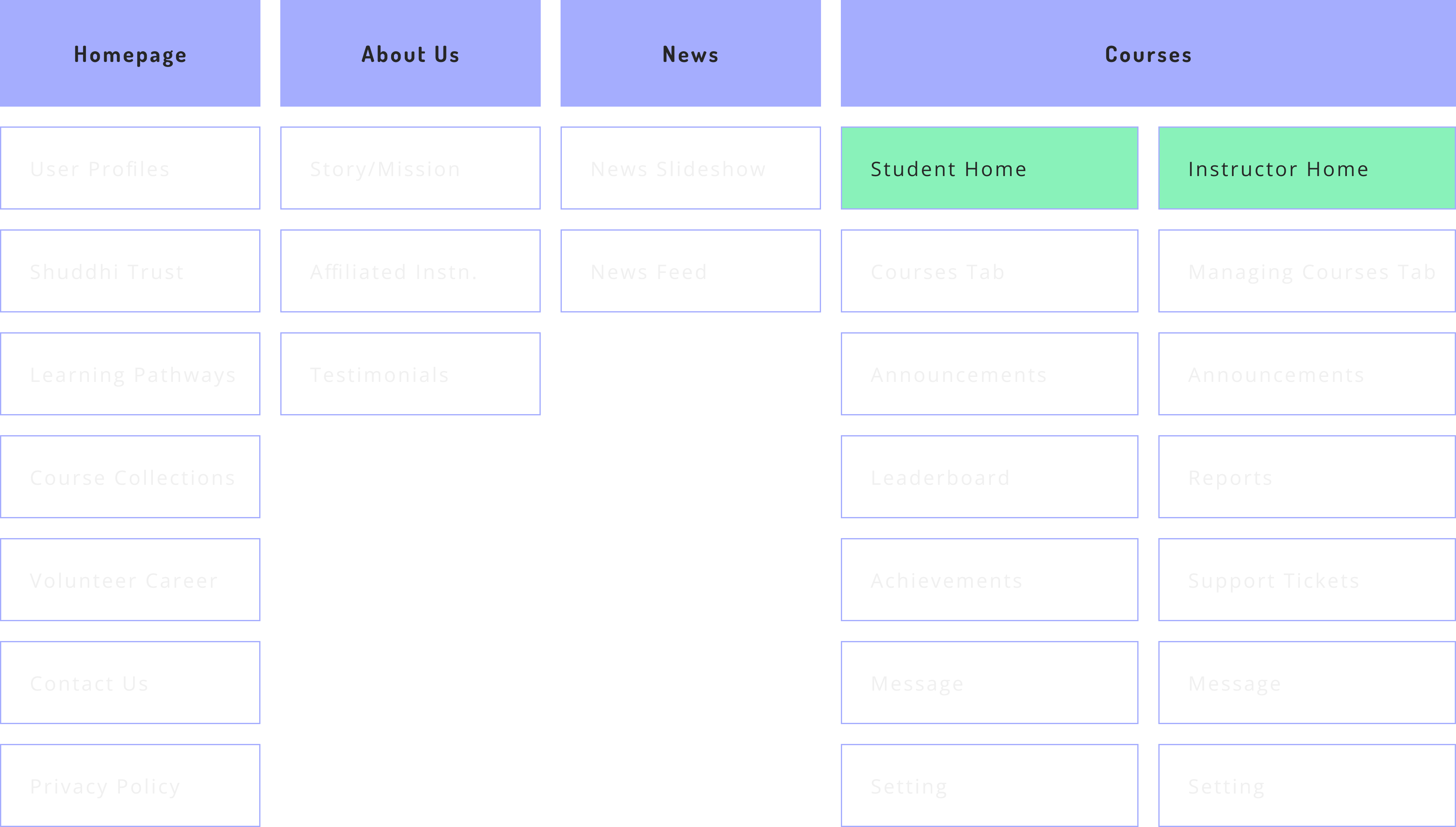
I have created two personas based on students and instructors.
How do we ensure smooth learning and teaching experiences for both students & instructors?
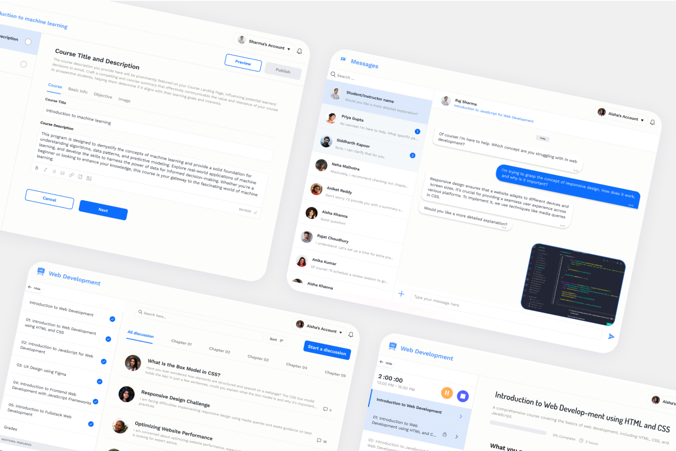
Addressing the pain points of both students and instructors, we have provided corresponding solutions:
In-platform message
Peer support
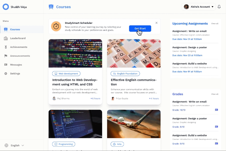
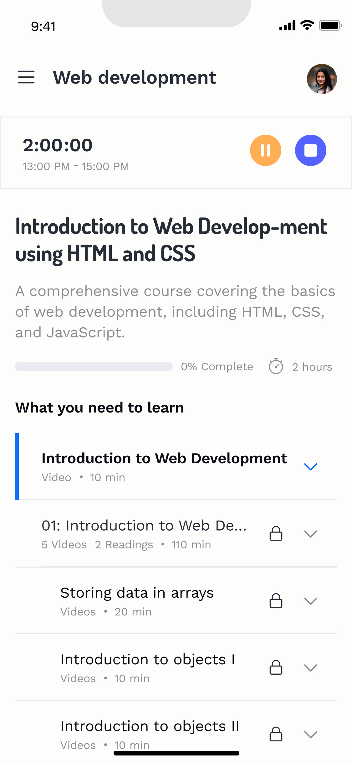
StudySmart scheduler
Organized course creation
Student progress tracking
 Senior designer:
“Sometimes I find myself scrolling down a lot to reach the next page button. Also, I noticed during testing that I often accidentally tapped the buttons next to it.”
Before
After
Iterate design 01
Enhance user’s experience
A clear layout
Senior designer:
“I think this "cards" here are missing something, they don't look clickable to me like the rest of the website. It is missing maybe a CTA like in the above the "read more.”
 Me:
Me:
I agree with you! But the repetition of "read more" for each card might causes visual fatigue for users. Do you think adding interactivity would be a better idea?
Before

After

Iterate design 02
Hover interaction
Provide auxiliary information
 Founder:
“The smart study scheduler feature seems to be a bit vague. When I click on it, I'm unsure of how it can substantially help students.”
Me:
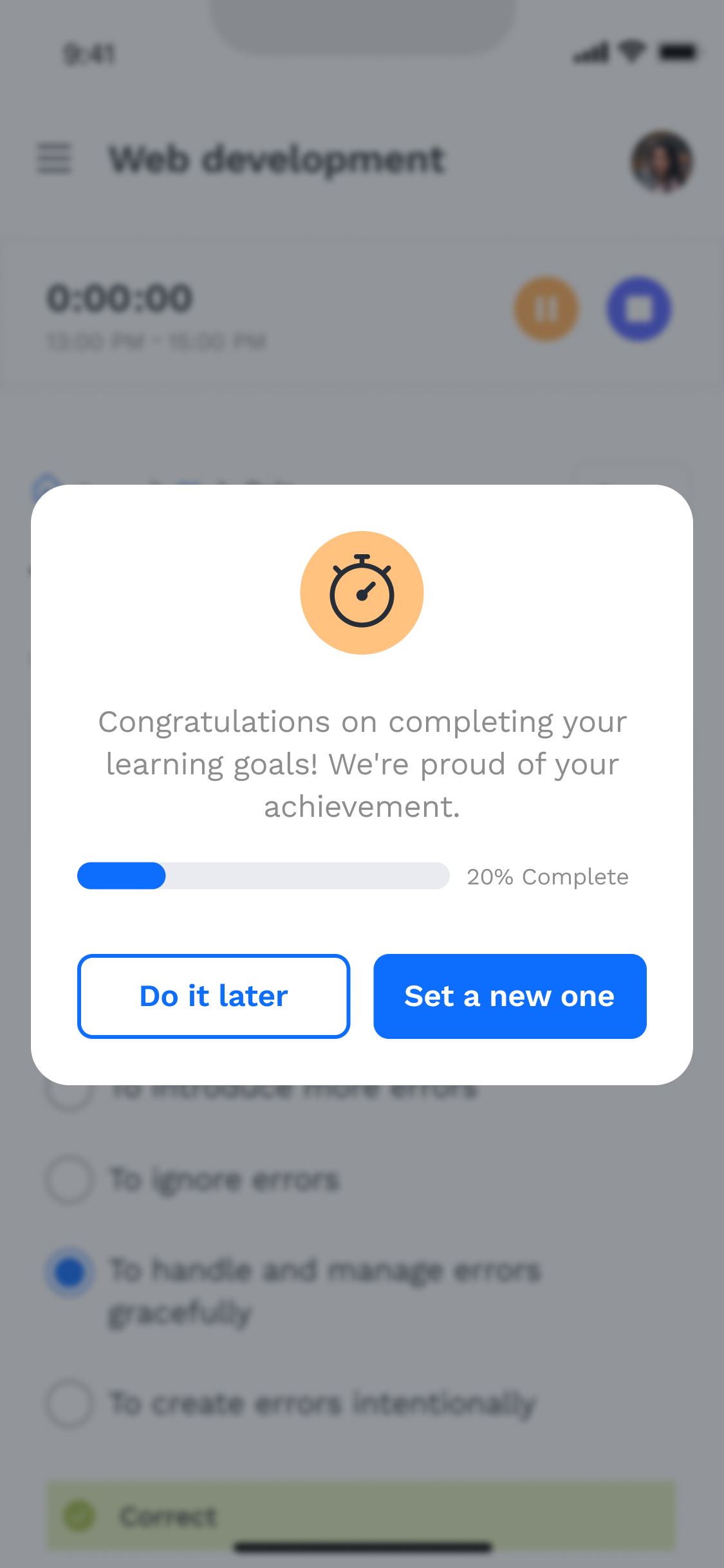
Maybe we could try incorporating a feature that lets users pause and resume a timer, while also emphasizing the upcoming content that needs to be studied
After
Iterate design 03
Countdown Timer
Precise learning schedule
 Project manager:
“I still feel that it's a bit inconvenient to click on a chapter and then select the corresponding course. Do we have any other solutions?”
Before
After
Iterate design 04
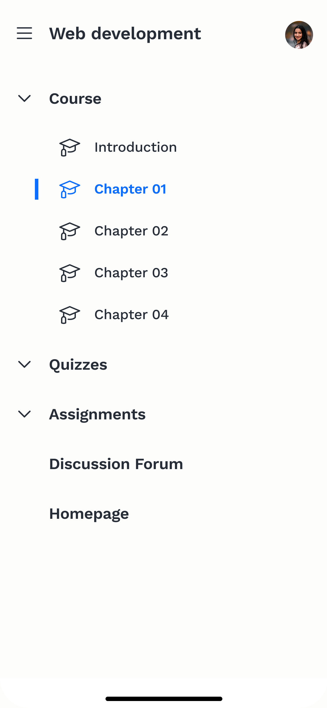
Integrate the menu
At present, we have completed the design for Phase I. Once the learning platform is officially accessible to students, we will make modifications to the website based on the feedback received. Concurrently, Phase II design work will commence, focusing on the implementation of student incentive mechanisms. The current plan involves students earning points by completing courses and using these points to redeem desired rewards on the platform.
During the initial phase of hi-fi design, it became apparent that the desktop wireframes lacked the vibrant appeal expected of an educational platform catering to adolescents; instead, they resembled those of a conventional tech company. Recognizing the need to align the design with the youthful demographic, we decided to inject energy into the interface by leveraging illustrations and icons. This strategic approach not only enhanced the visual appeal but also resonated better with the target audience, fostering a more engaging user experience.
The website design prioritized simplicity and clarity to facilitate development. By ensuring that design elements were straightforward and easily implementable, the development process was streamlined, minimizing complexities and potential obstacles.
Clear communication throughout the project significantly enhanced productivity. By maintaining open channels of communication and ensuring all team members were aligned with project goals and timelines, tasks were completed more efficiently, resulting in significant time and resource savings.
Copyright © 2024 Suri Wang


Copyright © 2024 Suri Wang