Meow's Pocket App
Aim to help college students easily and securely manage and track their finances.
TIMELINE
2023/24 weeks
Area of Interest
Product Strategy
My Role
Solo student project for Google UX design Certificate program. As a UI & UX designer designing Meow's pocket from conception to delivery.
Background
Throughout my college years, I faced challenges with my spending habits. Due to limited monthly funds, I often found myself spending more in the early part of the month, leaving me financially tight later on. Despite attempting various budgeting apps, I struggled to stick with them. This experience motivated me to develop a budgeting app aimed at helping college students improve their financial management.
Survey
I held private interviews with 5 college students who had initially used budgeting apps from Singapore and identified two distinct student groups.
 Financially tight students
 Aiming to save money
 Financially comfortable students
 Seeking to understand their spending
I discovered the reasons why students stopped using budgeting apps. Besides common worries, two students from the engineering department expressed worries about the privacy protection aspects of using budgeting apps.
Competitor Analysis
I conducted a competitive audit to familiarize myself with 2 direct and 2 indirect competitors. I identified several issues with budgeting apps currently available in the market.
There is a lack of apps that offer both bank sync mode and an equally powerful manual mode
Most apps lack convenient features to assist users in tracking expenses.
Apps with bank sync mode are struggling to ensure user's privacy and security
Some apps have complicated expense tracking steps and numerous useless features
Insights
Through the survey, interviews, and competitor analysis, temporary budgeting apps fail to encourage users to persist in keeping track. Based on the research that I have come up with 3 main UX insights to improve.
01. Simplified processes
Streamlining budgeting is essential for busy college students, who already face challenges in allocating time for expense tracking. A complicated system could expedite their decision to stop budgeting.
02. Achievements
A sense of achievement is crucial; college students need to accomplish the goals they initially set, and this sense of accomplishment helps inspire them to maintain the habit of budgeting.
03. Privacy
Spending details are highly personal information. A budgeting app should provide users with enough security to ensure that their privacy won't be compromised.
Solutions
01
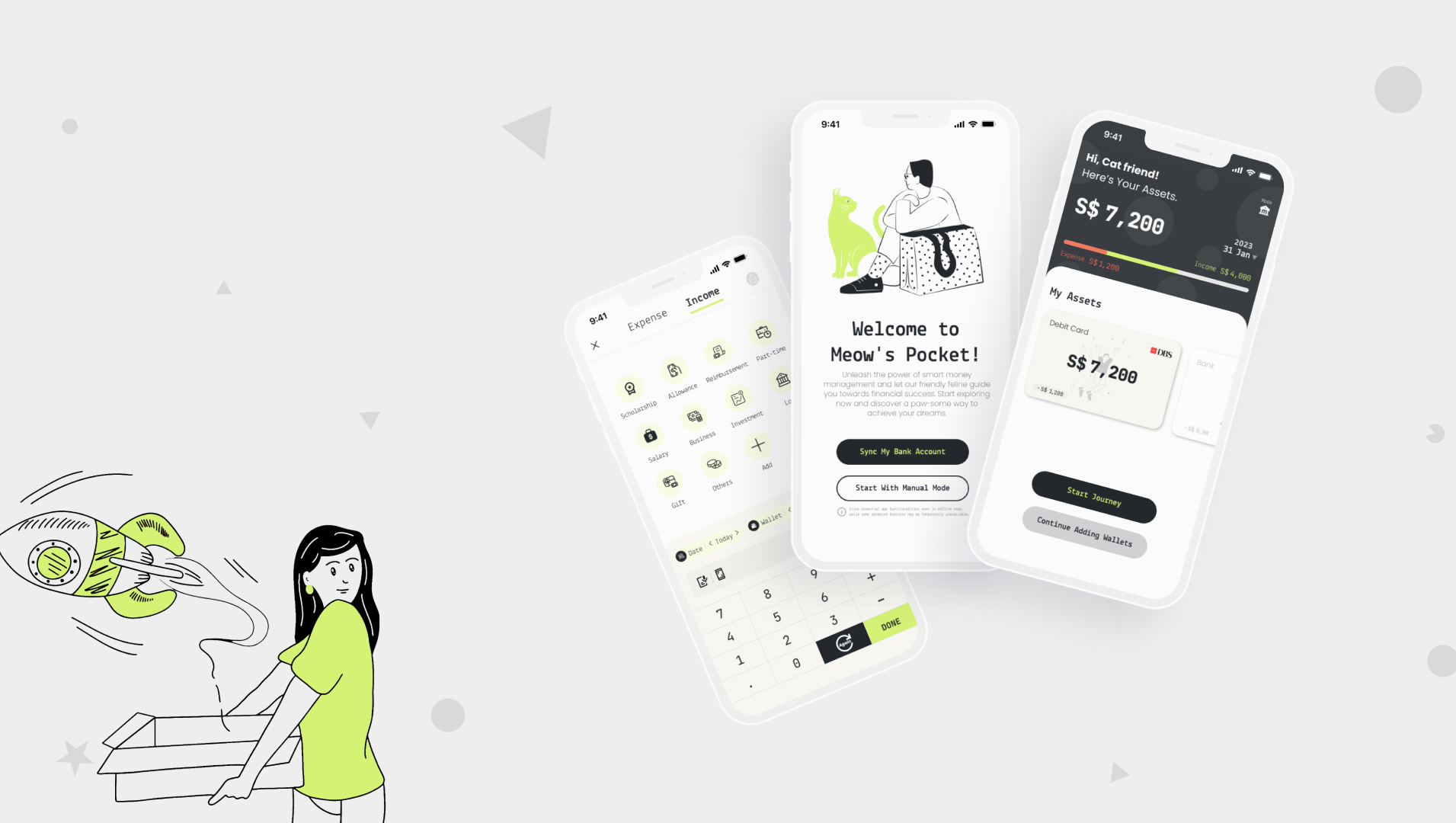
A simple & fast way
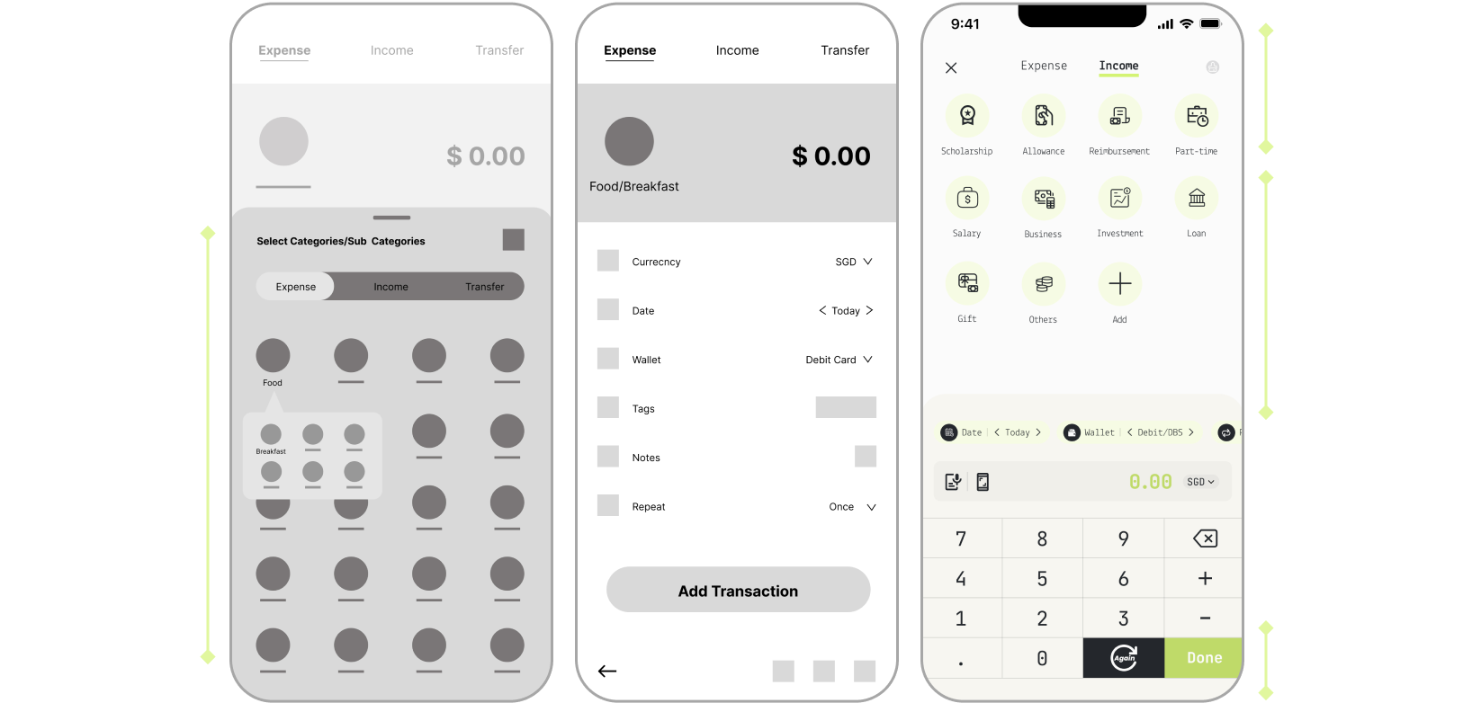
- Enable users to add transactions seamlessly in a single interface.
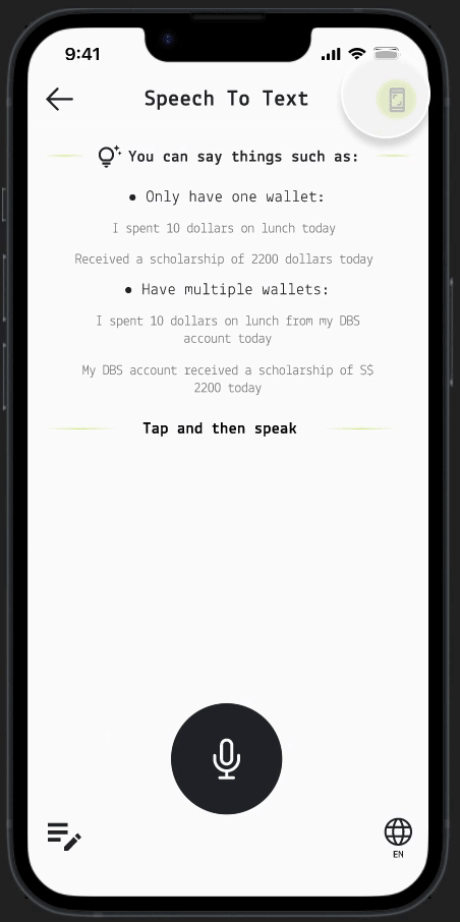
- Provide various solutions that allow users to effortlessly record expenses using the convenient features of speak-to-text and screenshot uploads.
- Users can connect their bank app to automatically import transaction records into Meow's Pocket.
02
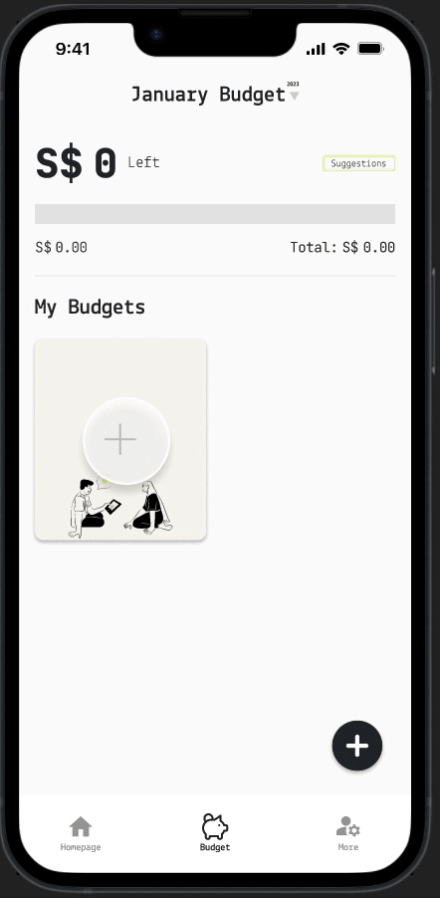
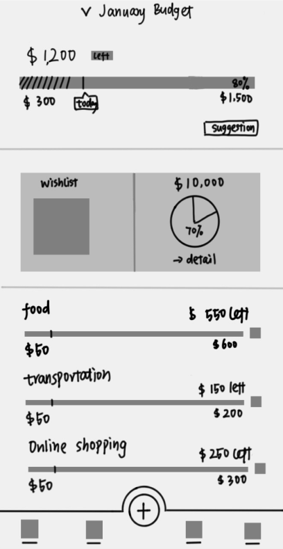
Budget management, wish fulfillment, clearly dashboard
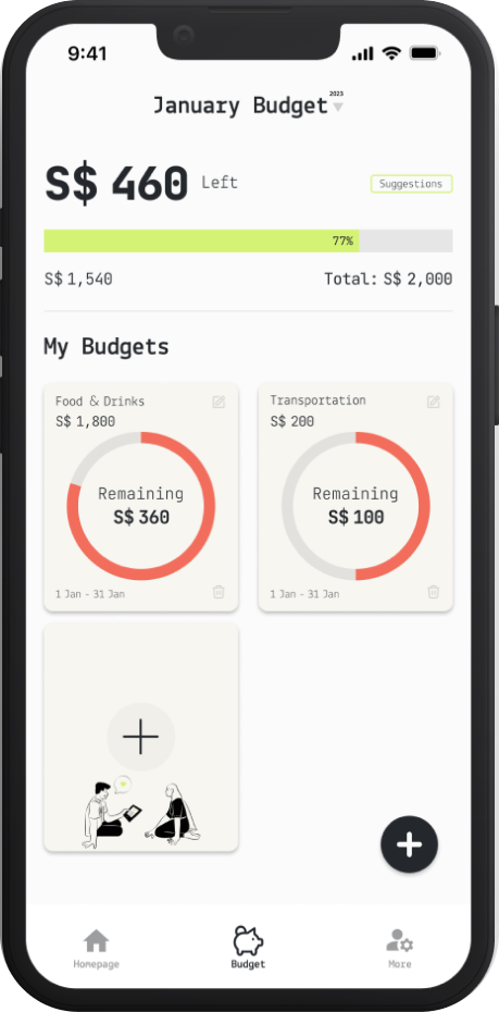
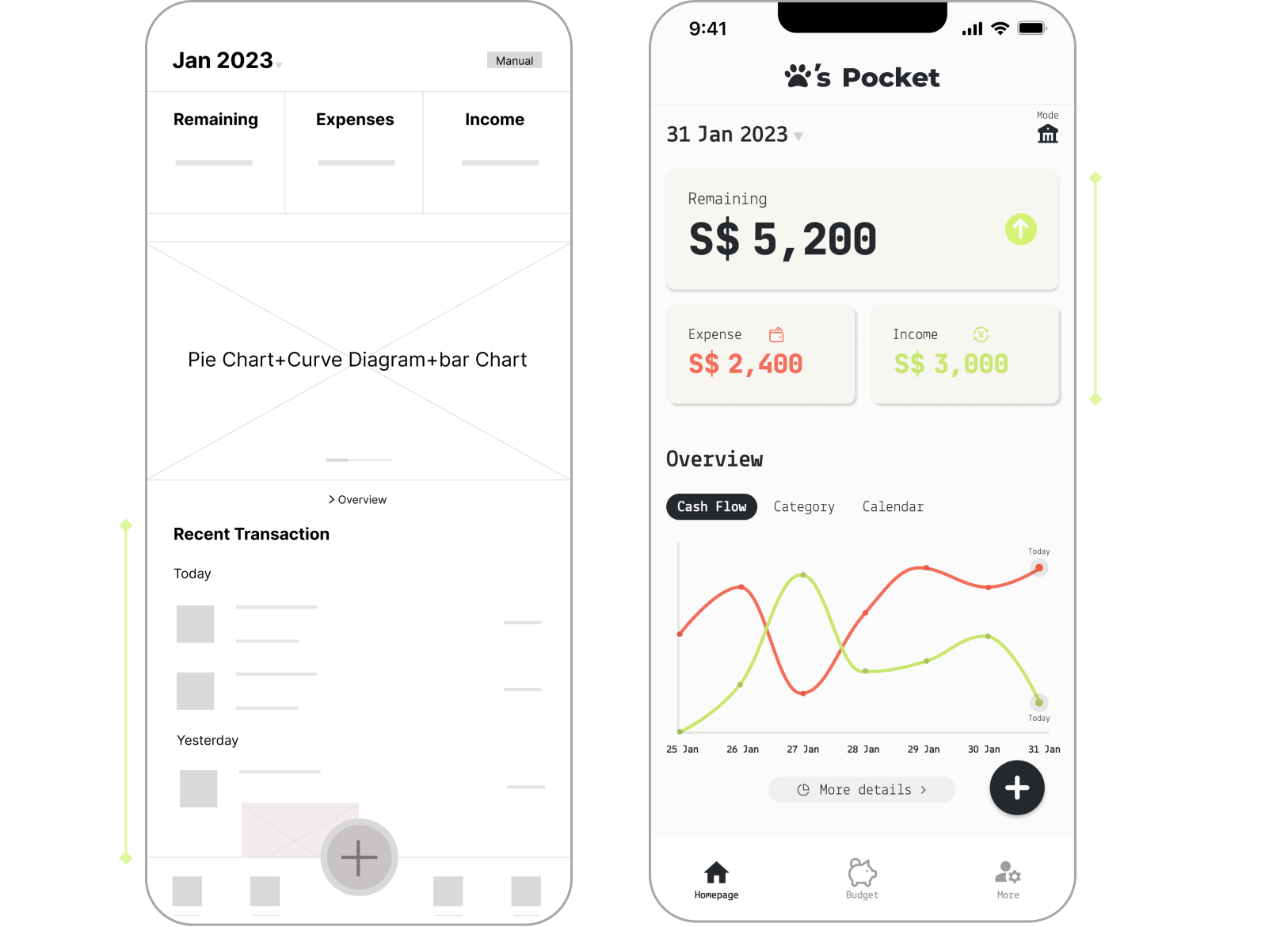
- Users can customize and set budget goals based on their plans. Multiple budgets can be added simultaneously, and budgets can repeat over time.
- Through the wishlist, users can easily track their current saving progress, providing motivation.
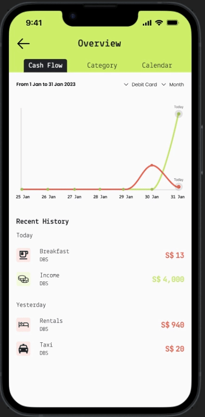
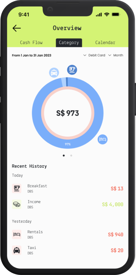
- By clicking on the dashboard, users can access a daily comparison of spending and income, along with a breakdown of expenditures by category and detailed daily spending information for the month.
03
Privacy and Security Protection
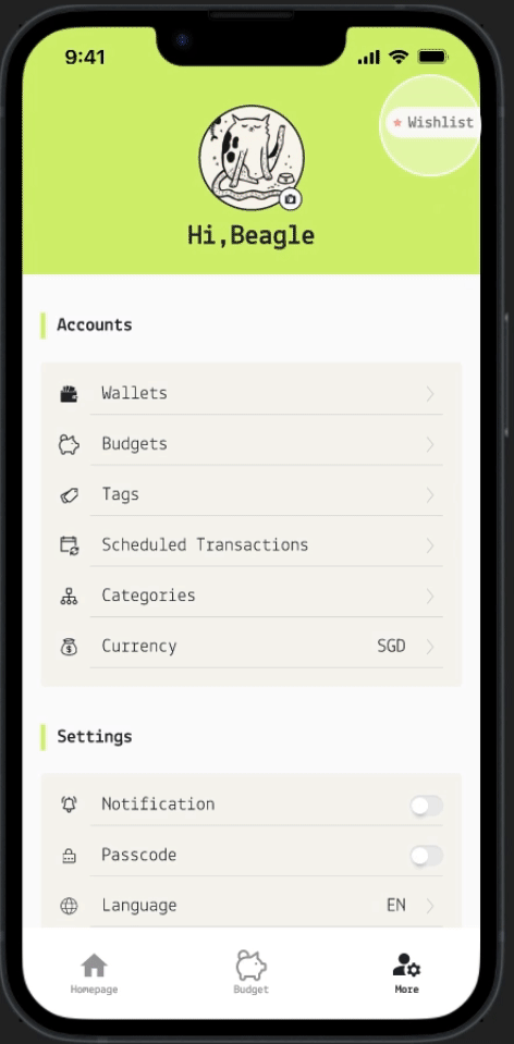
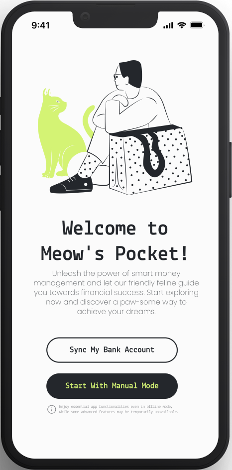
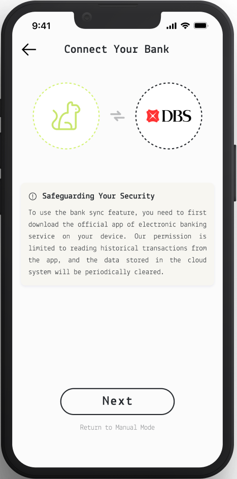
- Users can choose to use either "bank sync mode" or "manual mode" in the welcome page. In offline mode, data is only stored locally and functions requiring online access such as bank sync, speech-to-text, and screenshots upload are unavailable. Other features remain unaffected.
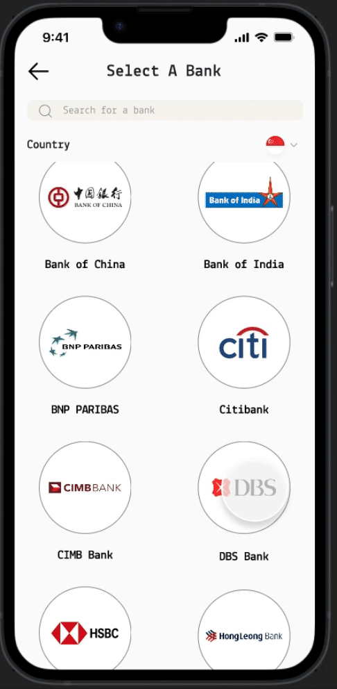
- To use the bank sync feature, users need to have the official banking app installed on their phone. Meow's Pocket doesn't require users to link bank cards or passwords; only authorization to read historical transactions is needed.
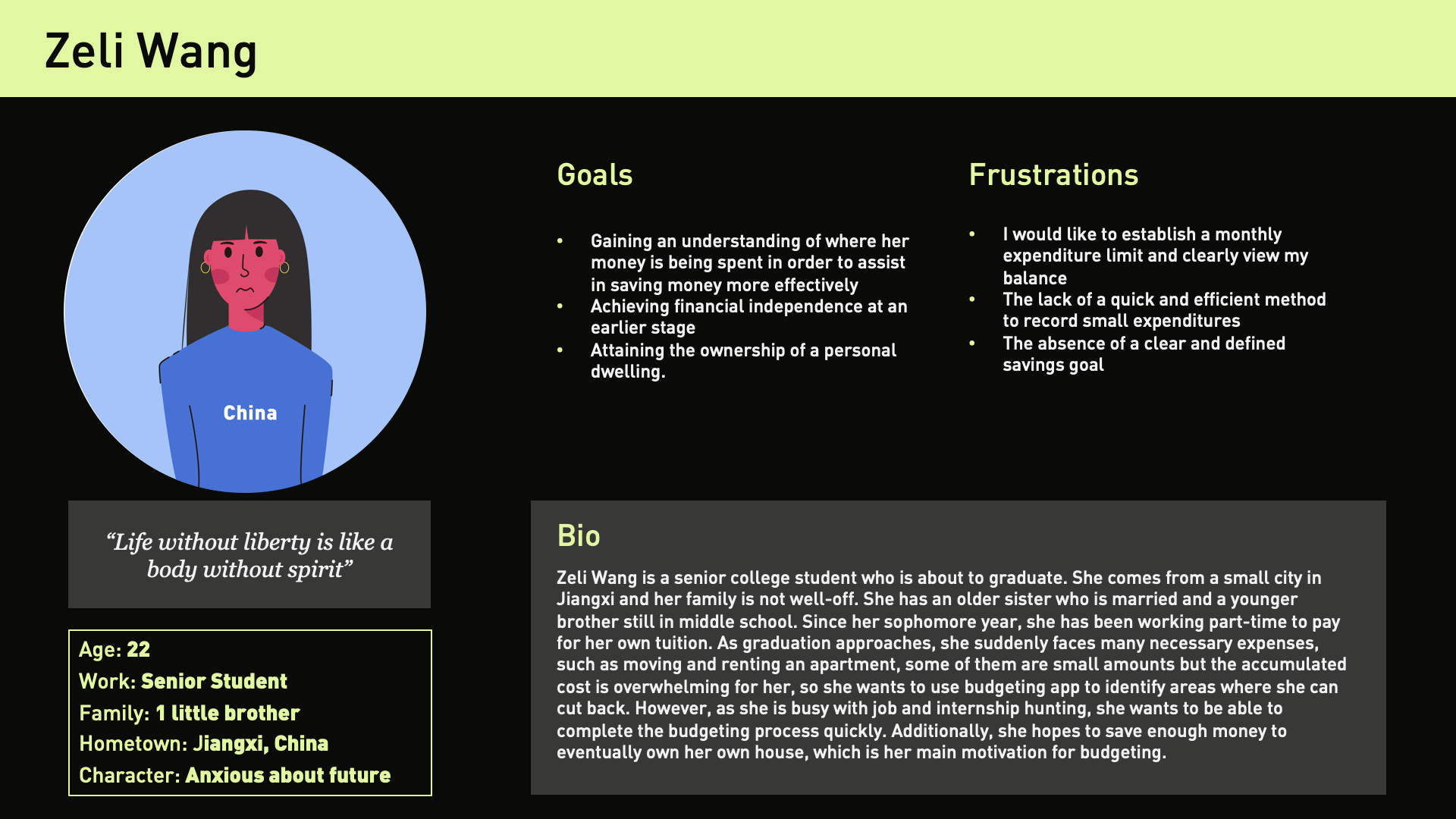
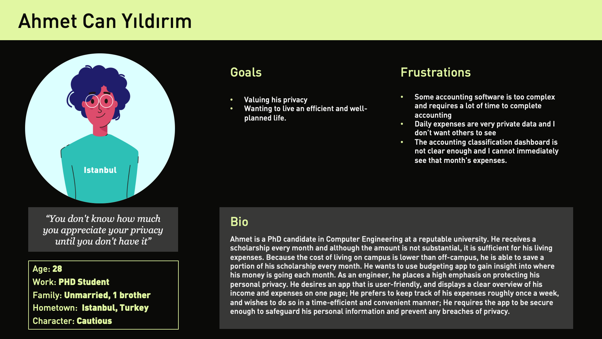
User Persona
Based on the previous research, I have created two distinct user personas.


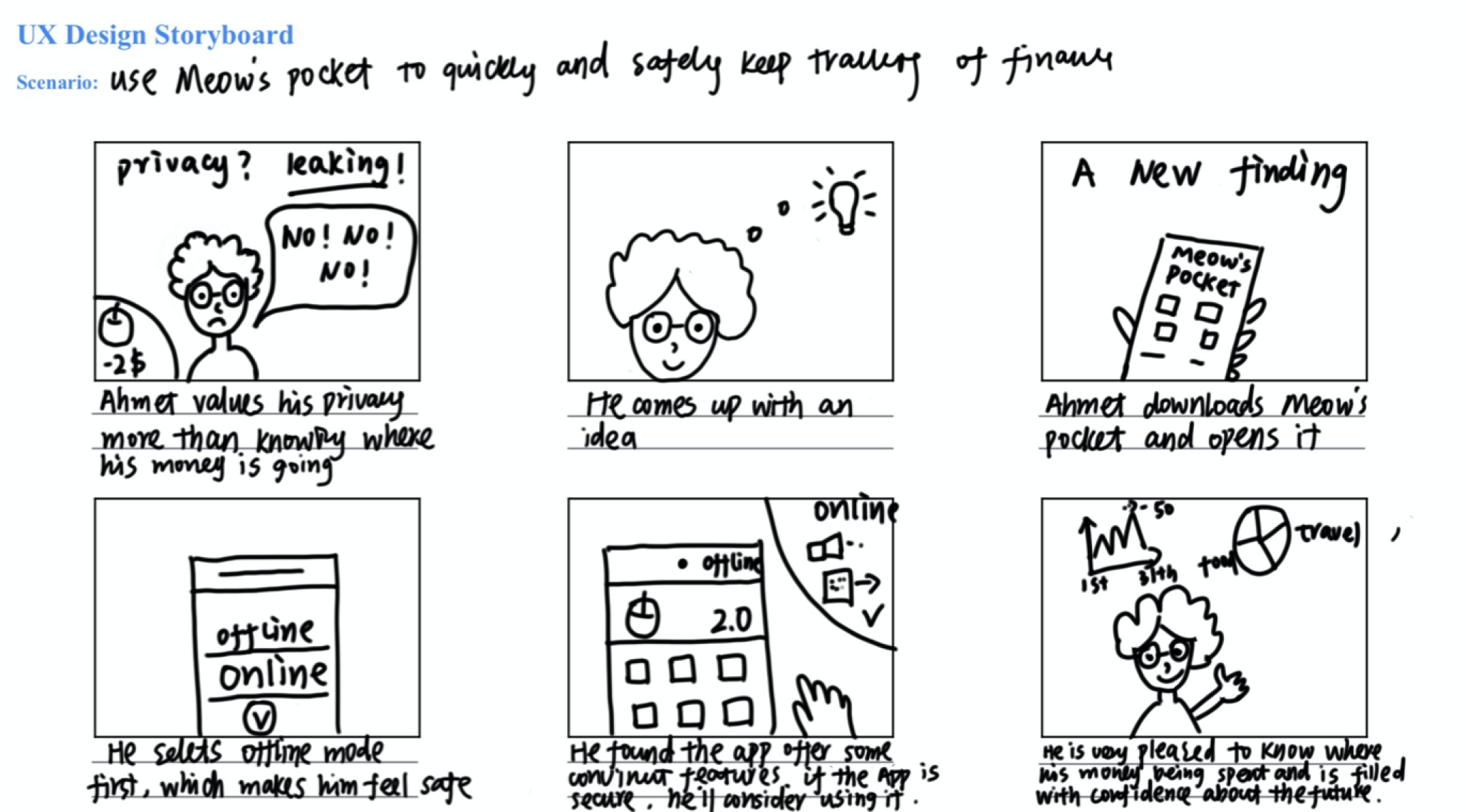
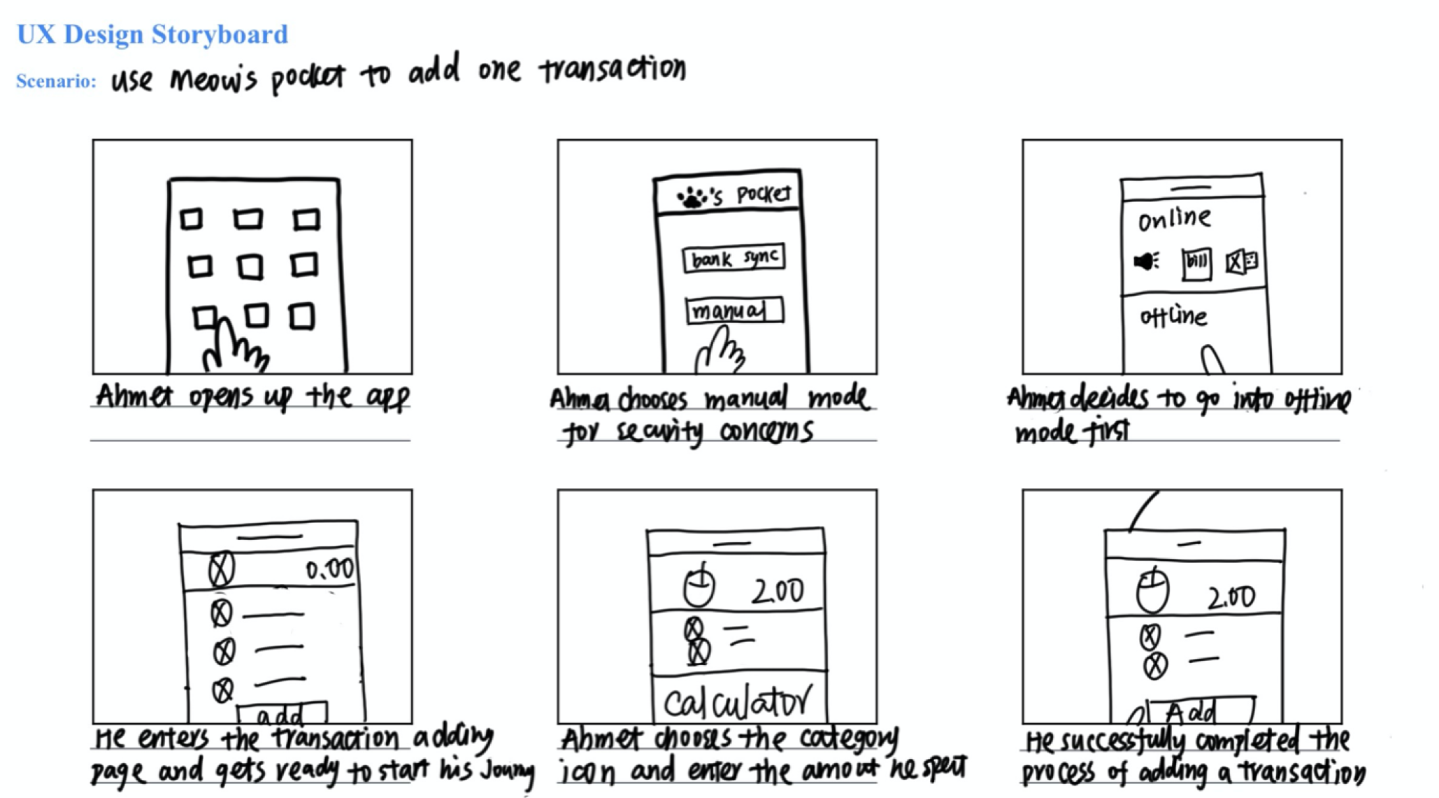
Storyboard
I created a big-picture storyboard and a close-up storyboard.
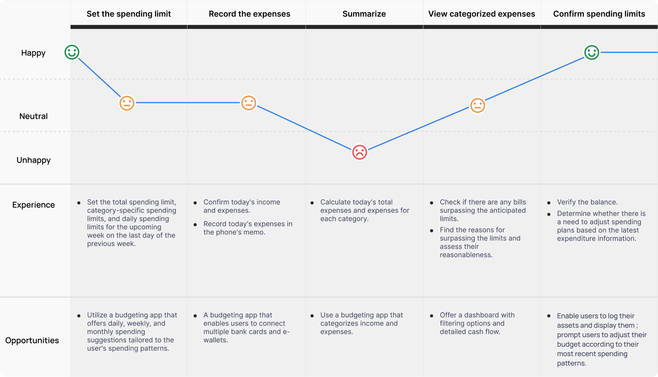
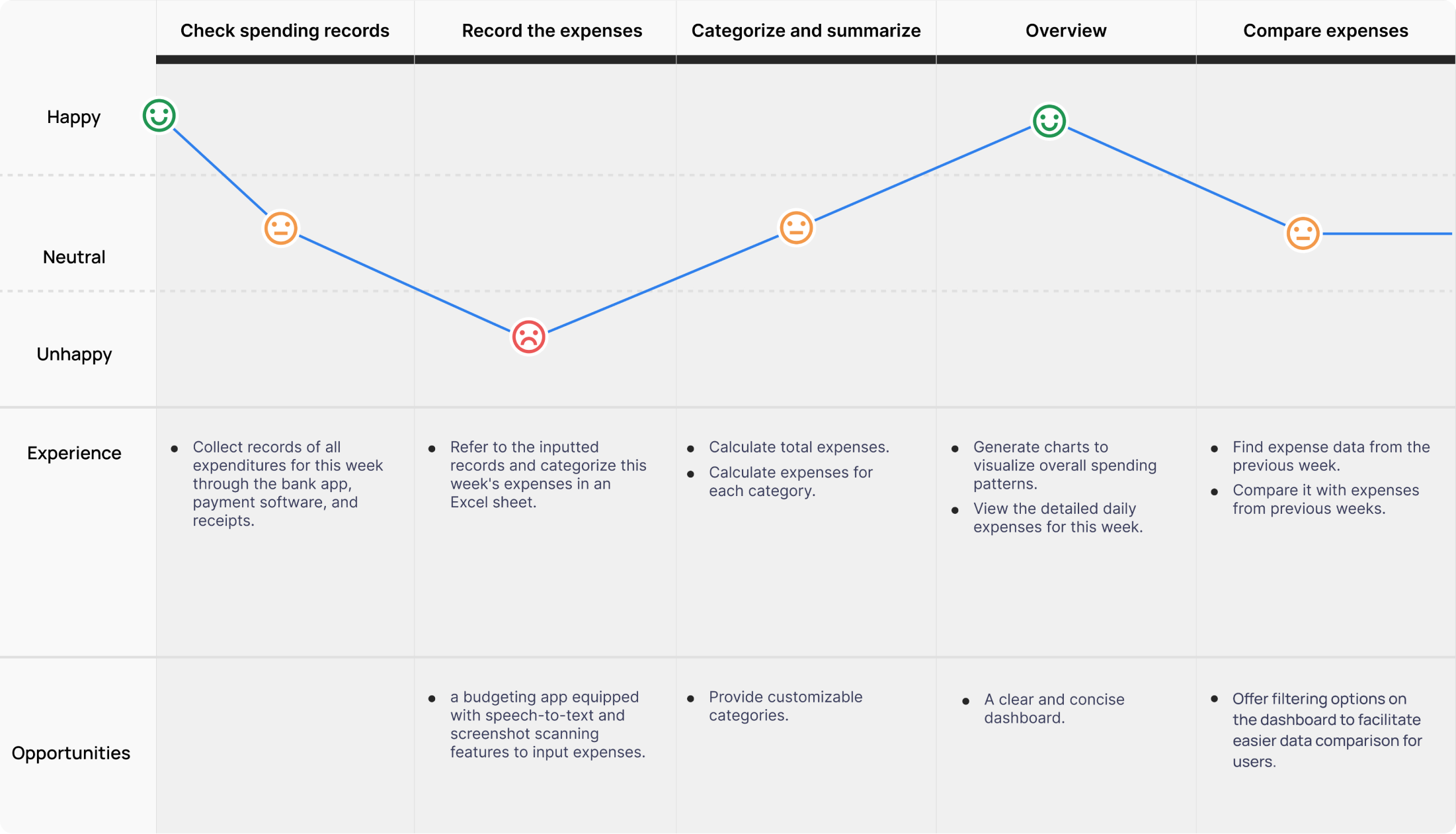
Journey Map
"I hope to find areas in my life where I can save money and achieve my dream of buying the ideal house."
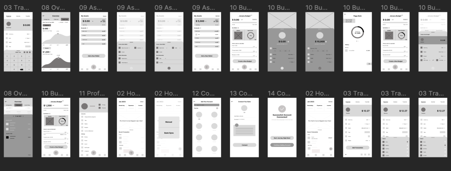
Lo‐Fi Wireframes
I first completed the design of paper wireframes and then proceeded to design the digital wireframes. Based on the user flow, I designed wireframes for the following steps: adding a transaction, trying helpers, reviewing dashboards, adding an asset, adding a wishlist, adding a budget, switching to bank sync, and revising a transaction.
Usability Test
I conducted a moderated usability testing with 5 participants. I prepared eight tasks for the participants to perform.
- Task 1: Ask users to add a transaction.
- Task 2: Ask users to locate 3 help tools and try to click them respectively.
- Task 3: Ask users to review the dashboard.
- Task 4: Ask users to add a new wallet under debit card.
- Task 5: Ask users to add a new wishlist and allocate money into piggybank.
- Task 6: Ask users to add a new budget.
- Task 7: Ask users to switch from manual mode to bank sync mode.
- Task 8: Ask users to revise a transaction automatically record by bank sync mode.
To extract insights from the usability study, I crafted an affinity map.
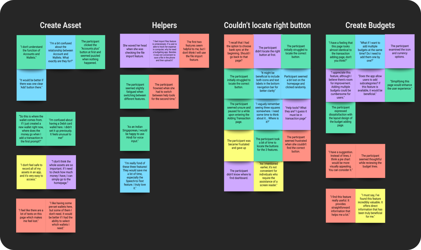
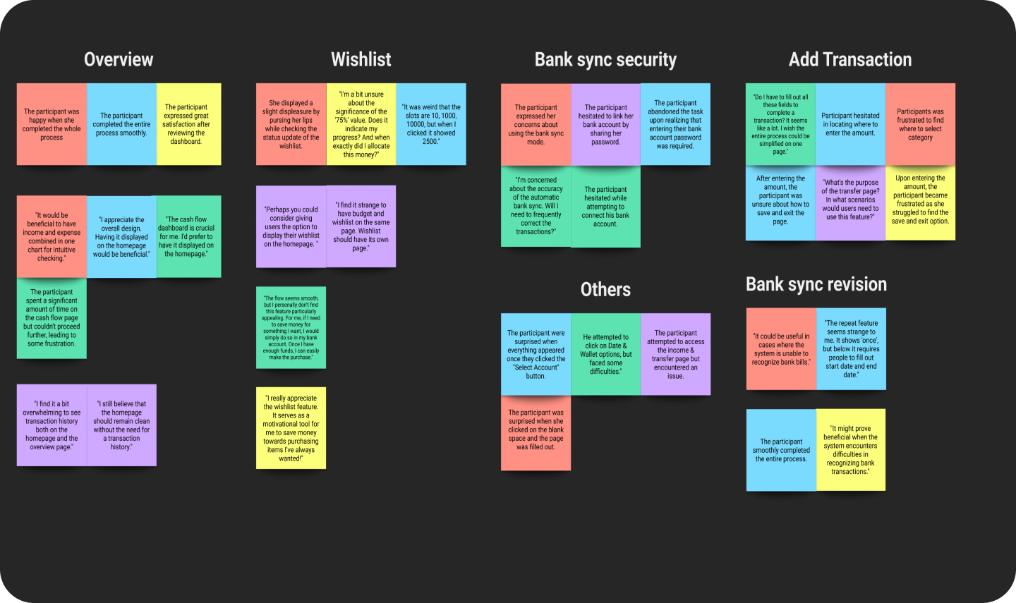
I have gathered the following five insights:
01. More Secure Way
Users are unwilling to provide their banking account passwords to a third-party app.
02. Simpler Operation
Users find some operations a bit complex and hope for simplification.
03. Add Multiple Budgets
Users desire the ability to add multiple budgets at once.
04. Repeat Budgets
Users wish to be able to replicate previous budgets.
05. Streamline Assets
Users found the process of adding a wallet a bit cumbersome.
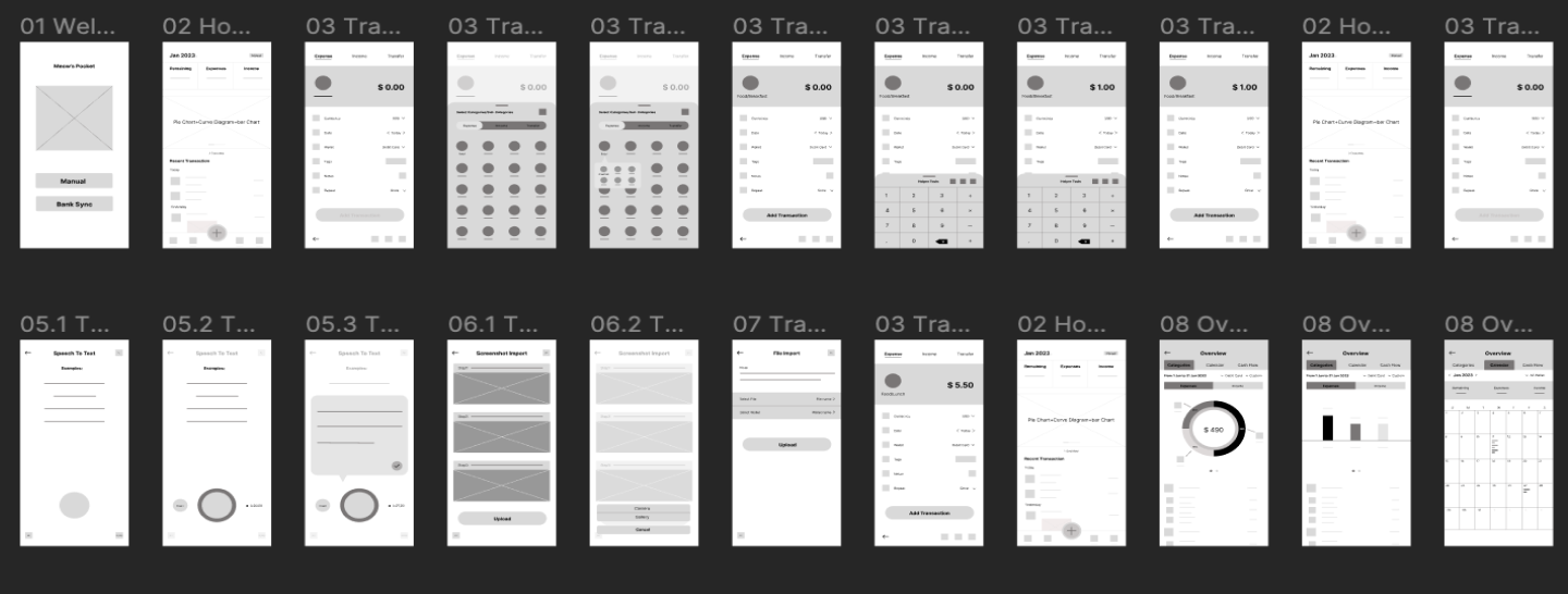
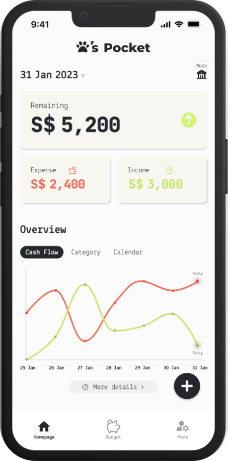
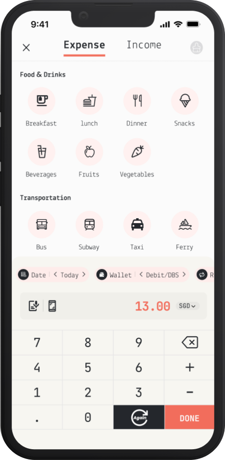
Final design
After usability testing, I found the previous design wasn't as simple as I had hoped. So, I made significant adjustments based on insights to create a more straightforward and convenient expense tracking experience for users.After completing the Hi-Fi wireframes, I conducted another usability test. I then made revisions to the Hi-Fi wireframes based on the feedback received.
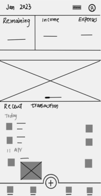
Homepage
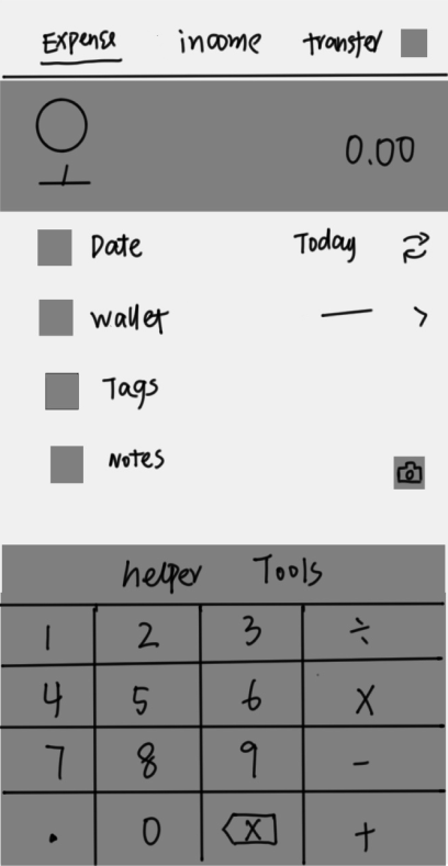
Add transaction
Dashboard
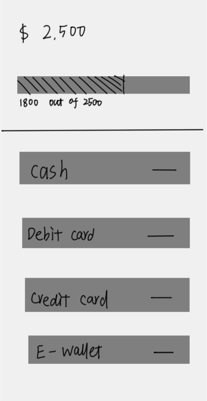
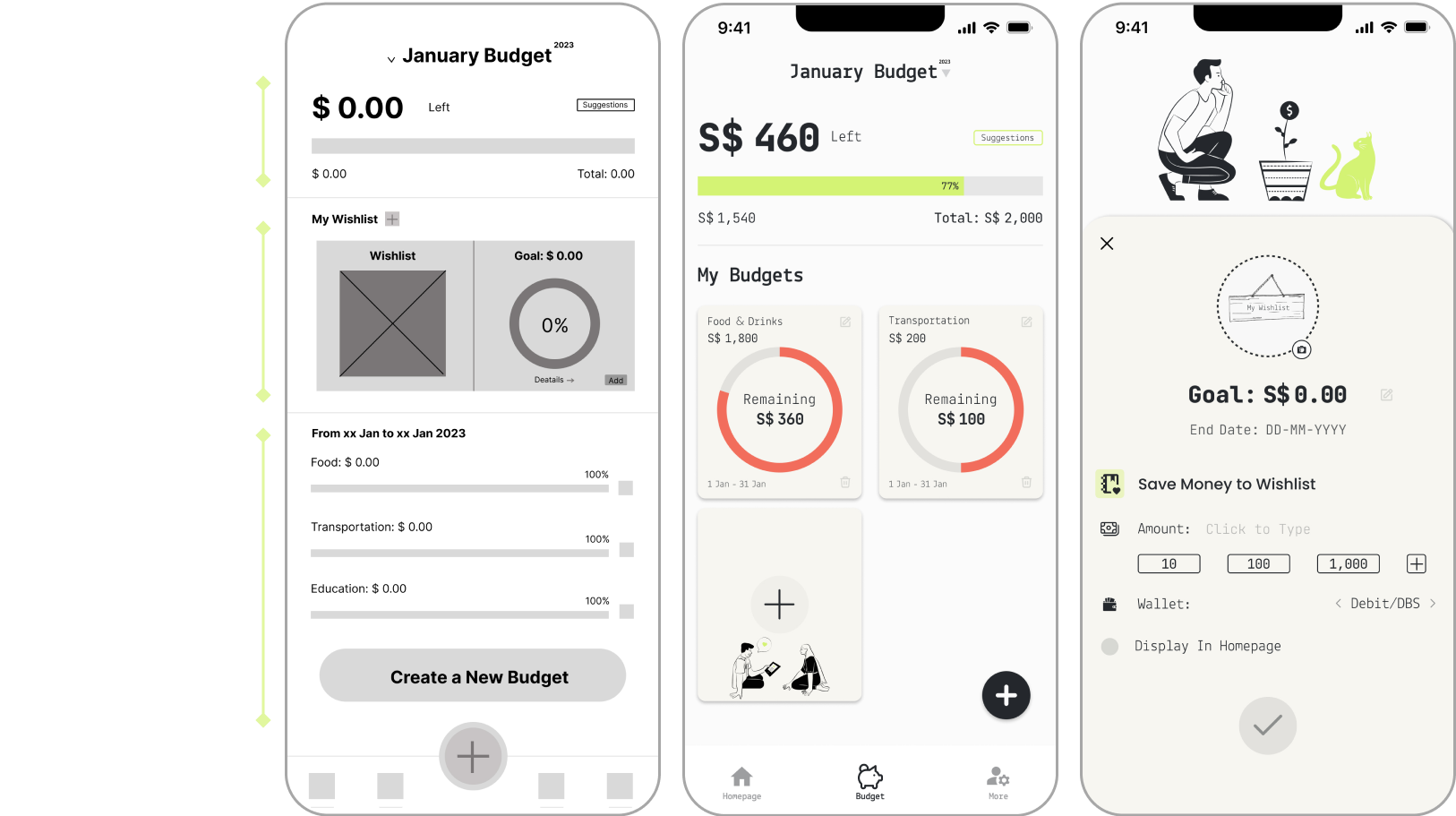
Budget
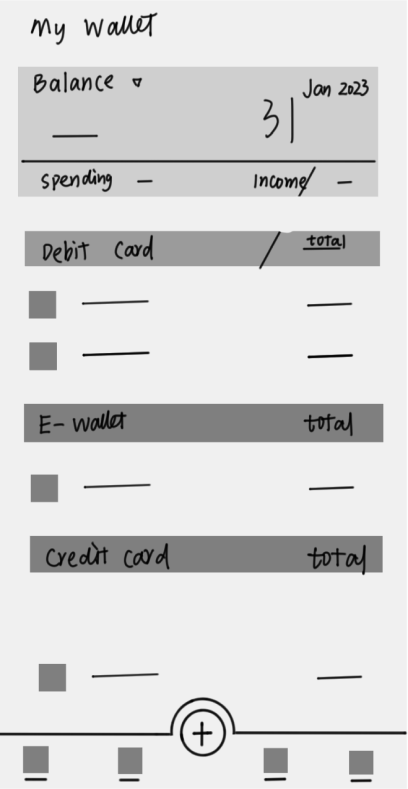
Wallet
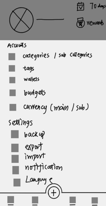
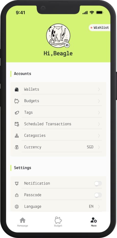
Profile
Adjustments
Homepage
- I simplified the homepage by removing the recent transaction. If users need to check their transaction history, they can click on the more details tab to access it.
- Additionally, users can choose to display their wishlist to the homepage, allowing them to track their savings progress in real time.
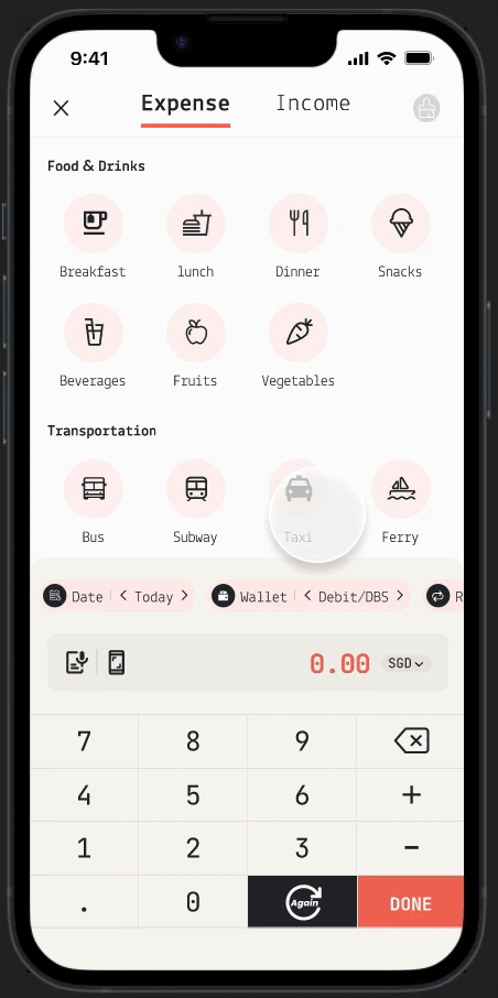
Adding transactions
- During the usability studies, users found the process of adding information somewhat cumbersome. I redesigned the entire pages to ensure users can complete the entire process on a single page
- All options can be changed using the left and right chevron.
- After redesign, users can click the "again" button to complete the addition of multiple bills.
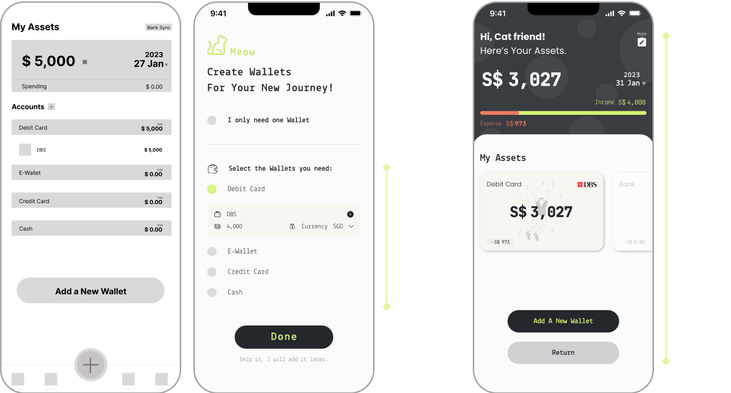
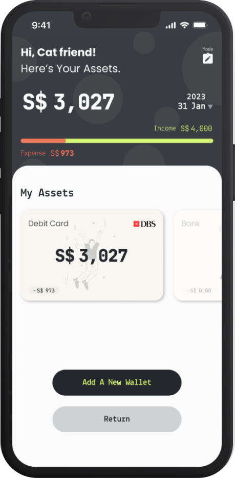
Assets
- Considering that adding wallets is not a frequently used feature, it has been removed from the navigation bar to better protect user financial privacy.
- Users have the option to add wallets initially or by clicking on "Assets" in the profile page.
- No longer is it necessary to add asset types before adding wallets; now, multiple wallets can be added at once.
Budgets & Wishlists
- I separated budgets and wishlist features to emphasize the distinct functionalities between the two.
- I replaced the bar chart for detailed budgets with a pie chart, providing a more intuitive display of budget expenditure progress.
- Simplified the budget addition process, allowing users to add multiple budgets in a single step.
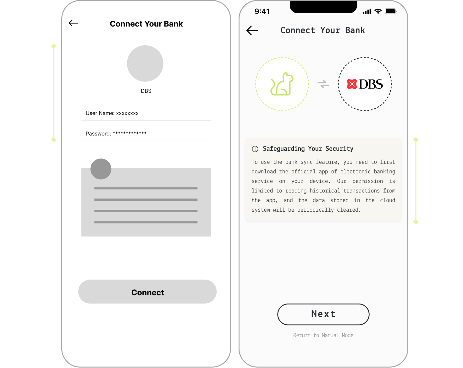
Bank sync
- Addressing users' concerns about the security of using bank sync, I transformed the process of requiring password and account binding to connecting with the official banking app.
- I also incorporated prompts to inform users that the app only has permission to access and read their historical transaction records.
Takeaways
Meow's Pocket is my first project into UX design, and while it has its shortcomings. Many user scenarios were overlooked, and even after the first usability research, the project didn't meet the initial expectations. However, these challenges have provided me with valuable insights and lessons for future.
01. Always prioritize user-centered design
Although extensive research was conducted in the early stages of the project, identifying the target users, pain points, and proposed solutions, these guidelines were not rigorously adhered to during the design process. I unintentionally added some processes and features that I deemed necessary, leading to an app that became cumbersome and more difficult to navigate. In the second redesign, I took a more empathetic approach, testing and adjusting each step promptly as a user. This iterative process resulted in a significant improvement in user experience.
02. Be courageous in facing failures and setbacks
After the first usability test, nearly every participant expressed that the app was somewhat complex and challenging to navigate. To enhance the user experience, it meant I had to overhaul the previous design and start from scratch. At that time, I had already created over 60 pages of wireframes for the app, making this decision particularly challenging. The old design represented the path I had walked, but it didn't signify that the past experiences were a waste of time. The crucial aspect was having a determined heart to learn from the convoluted process and strive to do better.
 Previous Project
Copyright @ 2024 Suri Wang